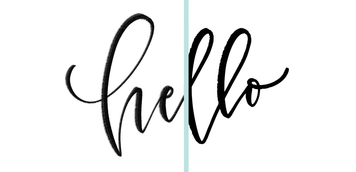
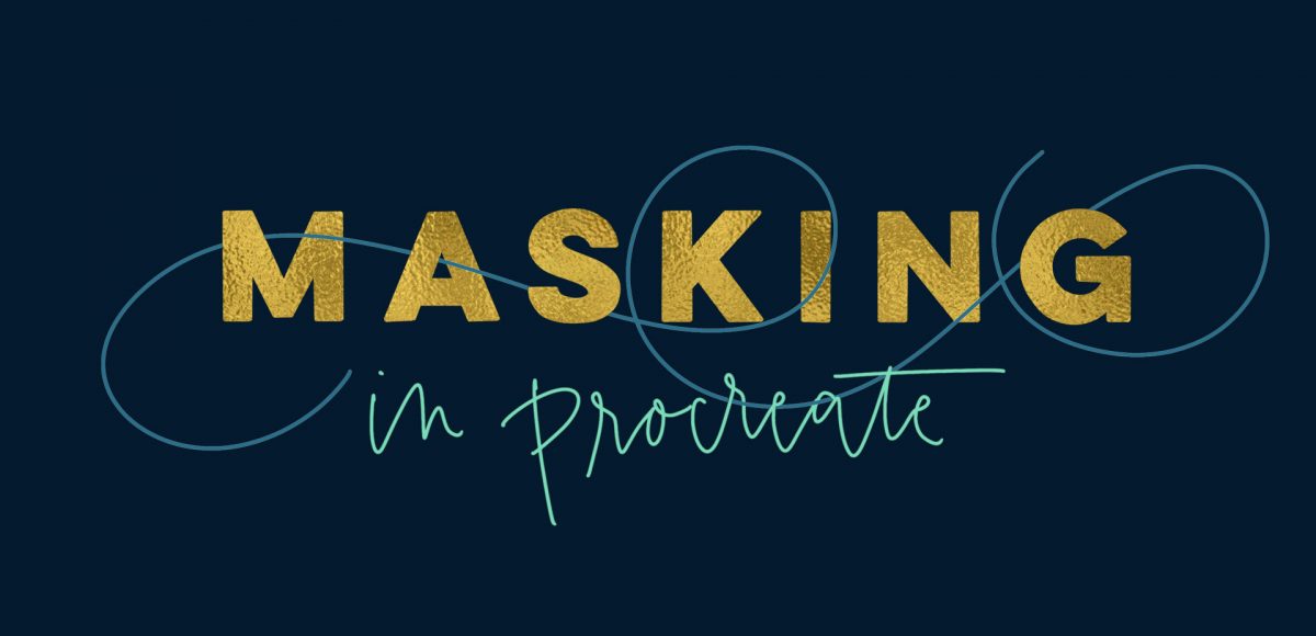
HomePosts Tagged "tip"

tip Tag

One major change that came with Procreate’s last update was masking. It might not have seemed major if you aren’t familiar with masking, but it was actually a bigger deal than it probably got credit for. Masking essentially allows for a non-destructive workflow. What that means, is instead of erasing something you don’t need, then having to draw it back in if you change your mind, masking ‘hides’ the part you don’t want and you can bring back the original easily at any time. Pretty nice. You can check out how awesome masking is in Photoshop here and it actually works pretty similarly in Procreate. In this week’s tutorial, I’ll take you through the two most common lettering scenarios where I use masking in Procreate. Once you begin masking, you’ll see the immediate advantages and how much faster (and efficient) it makes creating and editing.

If you love lettering – whether it’s on paper or an iPad, you’re probably familiar with how powerful your lettering becomes when it’s vectorized. Vectorization allows your lettering to be infinitely rescaled without losing quality. This means it can be put on anything, at any size and look as great as the day it was drawn. Since it’s a digital copy, it can exist for forever without fear of it being buried in past stacks of lettering experiments, too. It’s also a crucial step in creating open type fonts!

In this week’s video, I’m sharing my favorite, most reliable Illustrator trace settings when it comes to vectorizing lettering. These are the settings I use every time I vectorize to keep as much original quality as possible. Read on for it all!

One of my most viewed tutorials on YouTube is how to create seamless patterns in Illustrator (though you should be using the pattern tool in this tutorial if you’re using CS6 or newer!). Once you create a custom pattern, though, how do you save it, or export it to sell? Illustrator actually behaves a bit differently than Photoshop, since the version of Illustrator the user is on affects their ability to see the pattern or use it. In this week’s tutorial, I share everything you’ll need to know and consider when you save and export patterns in Illustrator.

I created something similar to this watercolor fireworks trick last year and I couldn’t stop thinking about it this year. It’s soooo easy, quick and really fun to create. In celebration of Independence Day here in the US (and the fact it lands on a Tuesday this year), today we’re going to create watercolor fireworks together 🙂 Grab your favorite watercolors, a waterbrush, a straw and let’s go!

One of my favorite time saving tools when using Photoshop is Photoshop actions. I have used these for batch photo and file delivery to clients in a professional setting, and batch editing when putting together photos for family. Whenever you need to apply (the same) multiple settings to many files or photos at once, you create an action, then just run it for all of the others and you’re done in no time 🙂 It’s basically the closest thing to magic I’ve seen Photoshop do. In this week’s tutorial, we take 3 photos (this one, this one, and this one) and create a unique action for them that sets all of their widths to 1000px and also applies a sepia tone effect to the photos. We apply everything we need to one photo, then hit a single button to apply the same exact multiple steps to the others. It’s cool. You should definitely check out the video below to see!

Welcome to Photoshop month! Because Photoshop plays such a large role in taking my designs further, this month I’m sharing some of the tools and tricks I use all the time in Photoshop. This month is specifically in celebration of my new Intro to Photoshop class with Brit + Co which launches tomorrow (today’s the last day to sign up and get 15% off using this link!). In the class, we create this outcome, which uses watercolor textures and lettering, so today I wanted to share some quick tips on adjusting watercolor textures for your specific needs.

I’ve been asked quite a bit lately how to change any watercolor texture to a specific color, so I think this tutorial was meant to be! Say you want to incorporate a custom watercolor texture into your branding – you love the texture, but it’s not the right color for your brand. Or, you just want it to be something else. In this week’s video, I walk you through three methods using Photoshop: changing all of the colors within the watercolor to something different, changing the entire watercolor into one specific color (which is great for branding), and changing just a portion of the watercolor to a different, specific color. All the tips in the video below!

This week’s tutorial comes courtesy of Kori, who requested an overview of the Illustrator Pathfinder Palette and I thought it was a great idea! The pathfinder palette is a ridiculous time saver when it comes to creating custom lettering, flourish designs, and vector-based Illustrations just to name a few. In this week’s video, we go over my favorite and most used pathfinder options. We’ll also go through a brief overview of the other options for you to get started. As a bonus, I’ve created a couple of Illustrator pathfinder palette cheat sheets (pdfs), so you have them handy whenever you may need them in the future. Download link to the cheat sheets and full overview video all below!

Happy Tuesday! I want to start by saying wow to everyone who has checked out Bounce Lettering! I’m so grateful for all of the kind feedback and I am so impressed and inspired by all of the wonderful projects that are coming out of the class! I thought I’d take bounce lettering/waterbrush lettering even a little further this week with a free add-on tutorial to both classes.

A style that is gaining in popularity over on Instagram is rainbow brush lettering. It would take foreverrrr to alternate colors to form a word, let alone form the word as pretty as you’d like with so many re-dips. In this week’s video, I’m sharing a trick for applying a rainbow of color to your brush lettering without a zillion re-dips in the process 🙂 There are two methods shown in the video – one to ease you into the process and the other to take full advantage of all the colors you’d like. Links to the products used + everything you need to know to start rainbow brush lettering below!

Today is a pretty gigantic day over here at every-tuesday. After 6 months in the making (and an entire last week on very little sleep), I’m excited to announce the Full Time Graphic Design ebook is finally available! This was a big project – the ebook itself is 74 pages long, and there are countless bonuses (even one including a full portfolio review + evaluation by me personally!).

What started as a basic guide evolved into a deep dive with little clips of my own experiences, from being hired – and hiring – and super specific tips (like the exact days and times which are best to send a cold email). Once I got going, I couldn’t stop myself from thinking of more and more little nuggets I had to include 🙂 Check out all the details here, and a full outline below!

Welcome to week 2 of the Every-Tuesday graphic design portfolio tips + advice series! Last week, we went over how to select the right projects to include in your portfolio based on your personal skillset strengths. This week, we’ll go over proper formatting for your projects, how many projects to include in your portfolio and what order to put them in to leave a memorable impression on an interviewer. These tips will contribute to graphic design portfolio best practices that you’ll be able to apply to your portfolio – no matter how much it changes – over the course of your career.

The Full Time Graphic Design ebook is less than a week away from being available! You’ll want to pick up your free portfolio project checklist to accompany this week’s video here and you’ll automatically be put on a list to be notified when the ebook (packed with tips + advice for getting a full time graphic design job) goes live 🙂

Happy Tuesday! A few months ago, I shared how to create a confetti brush in Photoshop and I’ve gotten a few requests since then on how to do the same in Illustrator. It’s a slightly different process, but can absolutely be done! In this week’s quick tip tutorial, I share how to create a confetti brush in Illustrator using two different examples: uniformly sized circular confetti and randomly scaled and rotated star confetti. This time of year, when real confetti is imminent, now you’ll have limitless digital confetti potential, too! Read on to see how!

After the tutorial How to Repeat Any Shape Along a Circular Path, I had a few questions on how to repeat shapes along any path, not necessarily a circle. In this week’s tutorial, I share a quick tip that will make repeating shapes along any path a cinch in Illustrator. In this video, we’ll utilize the shape tool and blend tool to create repeats perfect for borders, dividers or accents for your designs. We’ll go over repeating a single shape style and expand into a shape transition with a color blend for more complex results using the same technique. Read on to see how!

GDPR Icon

Your Privacy Matters

We use cookies to customize and create content that’s most important to you. We’ll never share the info we collect.

View Privacy Policy