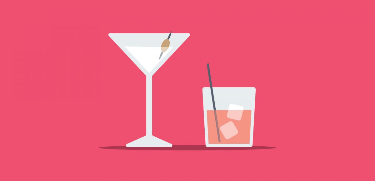
HomePosts Tagged "adobe" (Page 2)

adobe Tag

New Year’s Eve is less than a week away! To celebrate, I thought I’d cheers you Every-Tuesday style with a couple of cocktail glasses created in Adobe Illustrator. This tutorial is very doable if you’re a beginner, but the pace is a little quick, so just a head’s up. We’ll be in Illustrator CC for this one since we’re using the live corners option for smooth contours on our glasses. If you’re not using CC, this can still be done, but you’ll want to visit your appearance palette > stylize > round corners. Ready to get started? Full video + all the colors used are below!

Before we hit the end of the year, I was brainstorming ideas for winter themed illustrations, and mittens seemed perfect. I love how easy they are to make your own: design/decoration, shape and color! In this beginner-friendly (but some prior knowledge will be helpful) tutorial, we create a pair of cute winter mittens in Adobe Illustrator. Follow exactly or edit them to make em your own! Illustrator CC is recommended since we make use of some new features to speed up the workflow, but the result is still achievable in older versions. Read on to see how!

If you love lettering and watercolors, you’ve probably come across the watercolor galaxy effect. Whether just as a beautiful texture, or incorporated into lettering, it’s eye catching. Made from a variety of cloud-like colorful textures, it’s further detailed with doodled stars. There’s nothing like creating this traditionally with watercolors, but you can achieve this same look in Photoshop. In this tutorial, I take you through my process of creating and applying this watercolor galaxy effect to lettering, all within Photoshop. This is a bit of an advanced tutorial, so we’ll move through things quicker and with less detail than usual since there’s a lot to cover. Let’s dive into this galaxy!

As much as I love having digital calendars at my disposal, there’s still something about things written in by hand. If you feel this way too, this tutorial’s for you. In this video (perfect for beginners), we’ll create a printable calendar that fits any 8.5″x11″ or A4 sized paper. We’ll be making use of some handy Illustrator tools and by the end, you’ll have a watercolor floral calendar design fully created using Illustrator. We’ll use a watercolor floral bouquet from my kit here, but I also have a free mini kit you can pick up below if you’d like šŸ˜‰ Let’s get started!

When I first started using Procreate, I just selected the colors I needed at the time and went on my merry way. Once I became more comfortable with the program, accessing quick, harmonious color palettes dramatically changed (and improved) the feel of all of my artwork moving forward. Spending the time to experiment with and decide on the right color combos became increasingly more time consuming, though. Thinking about how I choose color palettes for my graphic design artwork, I realized I could utilize the same tools, but in a different way using Procreate. In this video, I’ll share how I now put together quick color palettes in Procreate in a matter of minutes. Once you see how easy it is, I promise, you’ll never look back!

I first realized how big of a deal enamel pins were when I worked on the Coca-Cola sponsorship of the 2014 Olympic Winter Games. The design studio I was working at had a giant collection of pins from past Olympic Games and they were incredible. Lately, I’ve been seeing them more and more and thought a tutorial on how to create the concept art for one would be fun. In this tutorial, I walk you through the exact steps I took when presenting enamel pin concepts to a client for approval. The goal was to give a general impression of how the pins would look once created. Once the client had approved them, our production director got in touch with a manufacturer who provided the info we needed to prepare production files. This video details the very first step of that process – read on to see!

I’m so grateful for the kind feedback the watercolor floral save the date had a few months ago! I thought this week it would be fun to follow it up with a watercolor floral RSVP card in Adobe Illustrator. If you’re new to working with watercolor florals in Illustrator, you’ve come to the right place šŸ˜‰ There’s a link below to my free watercolor floral mini kit and this tutorial is very beginner friendly. At the end of this video, you’ll be able to create a custom, print ready RSVP card ready for the mail. Read on to see how!

This week, we’re keeping things quick and easy with 3 simple pattern hacks applied to stationery borders in Adobe Illustrator: striped, chevron and polka dot. Borders in stationery design are a great tool to create focus on a message while still adding personality. With simpler projects, a seamless pattern swatch isn’t always needed and that’s where these pattern hacks come in šŸ˜‰ Ideas for using these pattern stationery borders could be: shopping lists, memo pads/notepads and greeting cards. In this beginner friendly tutorial, we’ll utilize an offset path, the blend tool and stroke palette. See it all below!

One of my favorite typography books is Shadow Type by Steven Heller + Louise Fili. I’ve broken the hardcover spine with all of the times I’ve paged through, sticky noted the tops of others and left it flat open, absorbingĀ as much as possible. What’s most impressive is the consistency and creativity with all of that 3D type, perfectly executed by hand. I’m constantly reminded of how lucky we are to have a program like Adobe Illustrator, makingĀ things inĀ seconds that once took hours. One shadow type project I’ve been working to perfect is dimensional signage typography. I love how the typography looks 3D and oftentimes has a long shadow, extending in the opposite direction. In this week’s tutorial, I’m sharing my method of creating that signage typography look usingĀ Illustrator!

Happy Thursday! Today I have an awesome gift to share with you! My friends at Vecteezy put together an incredible set of 8 seamless ink textureĀ patterns just for Every-Tuesday readers! I got so excited after I receivedĀ them that I started playing around with them right away (see below). This free set comes not only as ai files, but eps files, psd files, a photoshop pat file *and* png files. Instructions on how to use them + ideas for use are allĀ below!

A few weeks ago, I shared how to create this effect using an iPad with Procreate. This week, I wanted to share how easy it is to create typographic floating shadows in Adobe Illustrator, too! The method I use utilizes the blend tool and pathfinder palette and a few simple steps. This effect is perfect for headlines, special art projects or even signage. Read on to see it in action!

First off, I want to tell you this isn’t the sexiest tutorial you’ll ever watch, but it can be a giant time saver and really make you look like you know your stuff. So,Ā stick with me, because this is pretty handy to know: list format data merge in InDesign (sorry if that was a little eek-worthy to read, but you were warned šŸ˜‰ ) To accompany our save the date postcard from last week, this week we’ll create a wedding seating chart to go with the big day. Traditionally, data merge is used to automate large amounts of data into multiple pages, but it’s different here: we’re placing lists of data onto one page, so there are a couple small tweaks that need to be made. I promise this is super simple and you’ll be glad to have this in your designer arsenal when you see what it can do.

GDPR Icon

Your Privacy Matters

We use cookies to customize and create content thatā€™s most important to you. Weā€™ll never share the info we collect.

View Privacy Policy