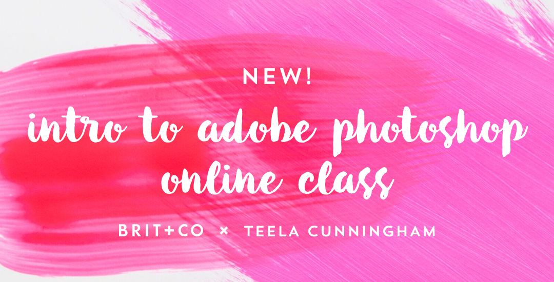
HomePosts Tagged "adobe" (Page 5)

adobe Tag

I’m so excited to announce that my newest class, Intro to Photoshop in partnership with Brit + Co, is officially available! If you’ve ever wanted to learn Photoshop but felt intimidated, weren’t sure where to start, or just couldn’t find a class that taught more than the interface, this class was made just for you 🙂

We cover all of the basics to give you the confidence to begin editing and enhancing photos on your own, and if you’d like to incorporate some design elements, we go over that, too. This is an online class that you can watch at your own pace (stop, pause, play) whenever it’s convenient for you. We go step by step to create this instagram post together (or use for any purpose you’d like!) in quick and easy, digestible steps.. steps that you’ll be able to repeat on your own for any project of yours in the future.

This week’s tutorial comes courtesy of Kori, who requested an overview of the Illustrator Pathfinder Palette and I thought it was a great idea! The pathfinder palette is a ridiculous time saver when it comes to creating custom lettering, flourish designs, and vector-based Illustrations just to name a few. In this week’s video, we go over my favorite and most used pathfinder options. We’ll also go through a brief overview of the other options for you to get started. As a bonus, I’ve created a couple of Illustrator pathfinder palette cheat sheets (pdfs), so you have them handy whenever you may need them in the future. Download link to the cheat sheets and full overview video all below!

Things have changed quite a bit in the last 5 years. Back then, it was perfectly acceptable to attach a pdf (which you had a zillion different variations of) to an email, but that just isn’t the case anymore. Pdf portfolios are a dated way of portfolio delivery on top of taking up valuable space in a potential employer’s inbox. Enter the digital portfolio age where having an online digital portfolio presence is essential for a graphic designer. Luckily, you don’t have to be a programmer or a super nerd to get your work online and looking fine 😉

This week, I’m rounding up options to get your portfolio up as quickly as possible, looking as professional as possible, and collecting some nice SEO in the process. All of the options – free and for a fee – available below!

This week’s tutorial isn’t the sexiest thing ever, but it’s extremely useful if you work on multiple machines, need to share digital assets with clients + fellow designers, are a super organized person looking to be more digitally organized, or have an old computer you’re in constant fear will crap out on you at any moment. This one’s for you!

One thing’s for sure, if you’ve been designing for any length of time, a program has crashed on you at some point and when you reopen, things look a little different in the swatches, brushes and patterns department. If you never saved these digital assets pre-crash, they are lost (along with that pleasant mood you had 5 seconds before) in file purgatory.

In this week’s tutorial, we’ll dull the pain of lost assets by going over exactly how to save patterns and brushes in Illustrator and Photoshop so you’ll know where to find them if you ever need a reinstall, or if you just want to share them. Read on to see how!

Happy Tuesday! This week’s tutorial comes courtesy of Brittany, who shared this photo with me, which I agreed would make a great quick tip tutorial! As a bonus, I’m sharing how to create multi-colored long shadow typography, in case you’d like to use more than one color for your shadows 🙂 We’ll create every version quickly in Illustrator using one simple tool and a couple of extra time saving options. This is perfect for gig posters, MTV-esque retro designs, greeting cards, or paired with simple icons. Read on to see it all!

One of my favorite things is taking a doodle and reimagining it digitally. If you’ve been here before, you know that’s true! One thing I find myself doing a lot with my mini doodles lately is turning them into seamless pattern brushes so they can connect to make (any length) dividers, laurels – you name it. There’s a little trick to getting them seamless and once you do, they are so much fun to play with. In this week’s tutorial, we’ll take a mini doodle, vectorize it, make it seamless, then convert it into a multi-purpose, seamless pattern brush in Illustrator. Read on to see how easy it is!

Happy Tuesday! A few months ago, I shared how to create a confetti brush in Photoshop and I’ve gotten a few requests since then on how to do the same in Illustrator. It’s a slightly different process, but can absolutely be done! In this week’s quick tip tutorial, I share how to create a confetti brush in Illustrator using two different examples: uniformly sized circular confetti and randomly scaled and rotated star confetti. This time of year, when real confetti is imminent, now you’ll have limitless digital confetti potential, too! Read on to see how!

Happy December! I’m not sure how we got here so quickly, but here we are! In the spirit of the upcoming holidays, I’m excited to say the next few weeks will all be holiday-specific tutorials. This week we’re going to start things off with a typography tutorial (my favorite kind) requested by Allison on how to form typography into a shape. To start the holiday theme off, I’ll share how I would create typography to conform to the shape of a holiday bulb using the word ‘Joyful’. Read on to see it all!

Happy Tuesday! This week’s tutorial comes to you courtesy of Lauren, who emailed me last week asking how to create a realistic paper cut out effect. With winter well on its way (my family in upstate NY has already had their first snowfall!), I thought a winter theme would work well with the effect. Do you remember these free hand drawn vector snowflakes from wayyy back? I thought it would be a good time to bring them back for this week’s tutorial and pair them with a more intricate snowflake to really show off the handmade look of this effect. I also happen to have a digital recycled paper pack and handmade paper pack which I thought would bring some nice authenticity to finish off the whole piece (pick up some free ones here). Read on to create your own!

Welcome to Part 2 of how to create 3D typography from scratch! In this final video, we take everything we created in Part 1 using Illustrator and bring it into Photoshop. Using Photoshop, we’ll add custom shadows and texturize those shadows to add extra visual interest and dimension. At the end of this video, you’ll have your own custom, print ready 3D typography you can use for social media profiles, posters, prints and monogrammed stationery. Let’s get started!

Happy Tuesday! First of all, I have to tell you that I’ve been completely overwhelmed by all of the kind comments from last Friday’s post. My heart is bursting with gratitude. Thank you so very much for making this past weekend one I’ll never forget!

My co-workers gifted Spencer and I this amazing typography book as a going away gift last week and I have a serious problem with putting it down! There’s something that completely pulls you in when you lay eyes on the shadow type in the book – each layer so carefully planned, highlights and shadows in perfect contrast with one another along each angle and curve. Handmade type back in the day was so killer. I’m jealous of those craftsmen and craftswomen type masterminds. Of course, I couldn’t help myself with creating my own, digital form, inspired by pages from the book. In this week’s tutorial, we’ll create our own multi-layered 3D typography from scratch in Illustrator. In part 2 next week, we’ll bring that typography into Photoshop to add texture and enhance highlights + shadows to complete our type. Let’s gets started!

Seamless patterns in Illustrator have been on my tutorial list for a while, so I’m very excited for this week! There’s something about the anticipation right before you test your pattern that I love. The total surprise when you see this pretty little square you made repeated a dozen times – suddenly the little square looks the same, but entirely new. And then go ahead and imagine it on your favorite throw pillow, mug, notebook, mousepad, comforter, wallpaper..it’s a great moment for a designer, even if they’re just daydreams 😉 My goal is to bring you one step closer to those daydreams this week with a method you can use to create seamless, repeatable patterns no matter which version of Illustrator you have. We’ll take a square with elements from the 100+ Vector Leaves and Flourishes pack and go step by step to achieve a fully usable pattern at the end – color palette included. Let’s go!

GDPR Icon

Your Privacy Matters

We use cookies to customize and create content that’s most important to you. We’ll never share the info we collect.

View Privacy Policy