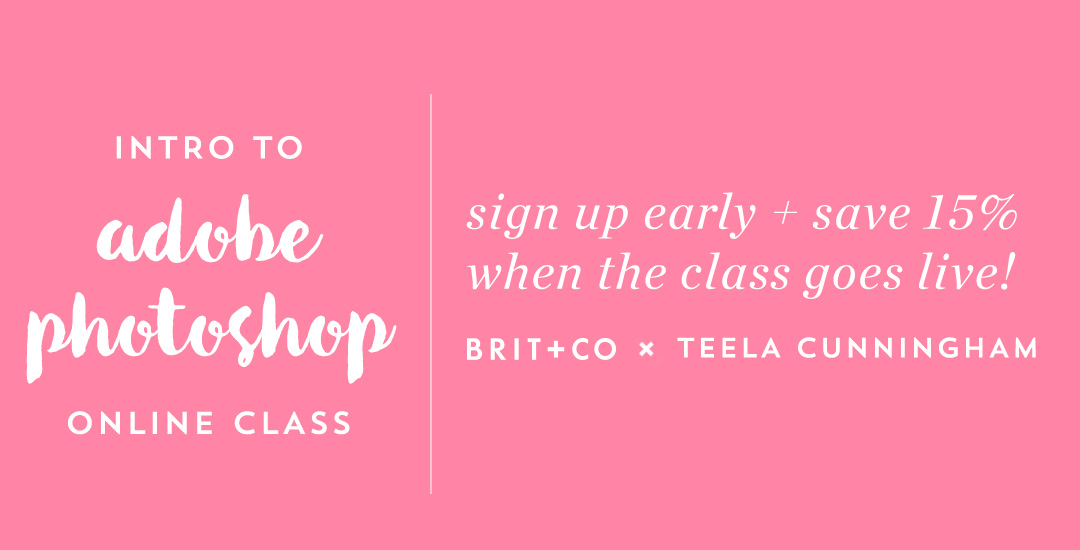
Intro to Photoshop Class: Discount Ending Soon!
When Brit + Co asked if I was interested in teaching an Intro to Photoshop class, it felt like the stars were aligning.
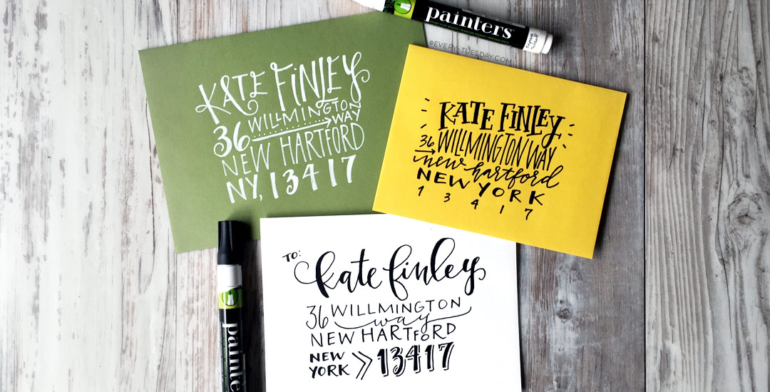
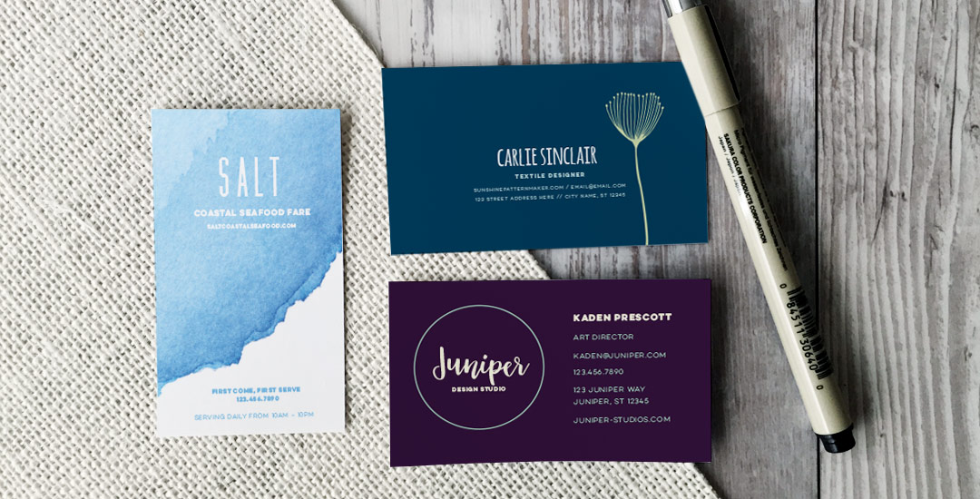
Although we go through a lot of Illustrator work here, I work in tandem with Photoshop on a daily basis. Photoshop gives me the opportunity to improve watercolor textures, lettering and photo editing that I might use later with Illustrator, or I’ll bring my Illustrator work into Photoshop to create the final piece. Because Photoshop plays such a large role in taking my design work further (or just editing nice pics for Instagram!), an Intro to Photoshop class was on my list to create this year. You could say I was a *little* excited to create it so soon with Brit + Co’s amazing team 🙂
0 Comments