HomePosts Tagged "type" (Page 4)

type Tag

I secretly love creating tutorials that appear more difficult than they actually are. This week’s tutorial is exactly that, but also perfect for beginners with a really cool outcome. In this tutorial, we intertwine text and vector elements to draw attention to our messaging and make it visually striking at the same time. Read on for all the details!

Ok, friends! Today is *the* day. My newest online course, Learn Font Making, is now open for enrollment (for one week only!).

When I started learning how to create hand lettered fonts, I definitely had the impression it was some super secret skill. I searched tirelessly for helpful tutorials that weren’t filled with a ton of ‘expert font making’ language I couldn’t understand. It was really hard to piece together little things I learned here and there, and I was still left with a lot of unanswered questions. Once I figured out the process, I knew I had to share it in a way anyone could learn. So! That’s what this class is: all step-by-step, beginner friendly with no confusion and as straightforward as possible.

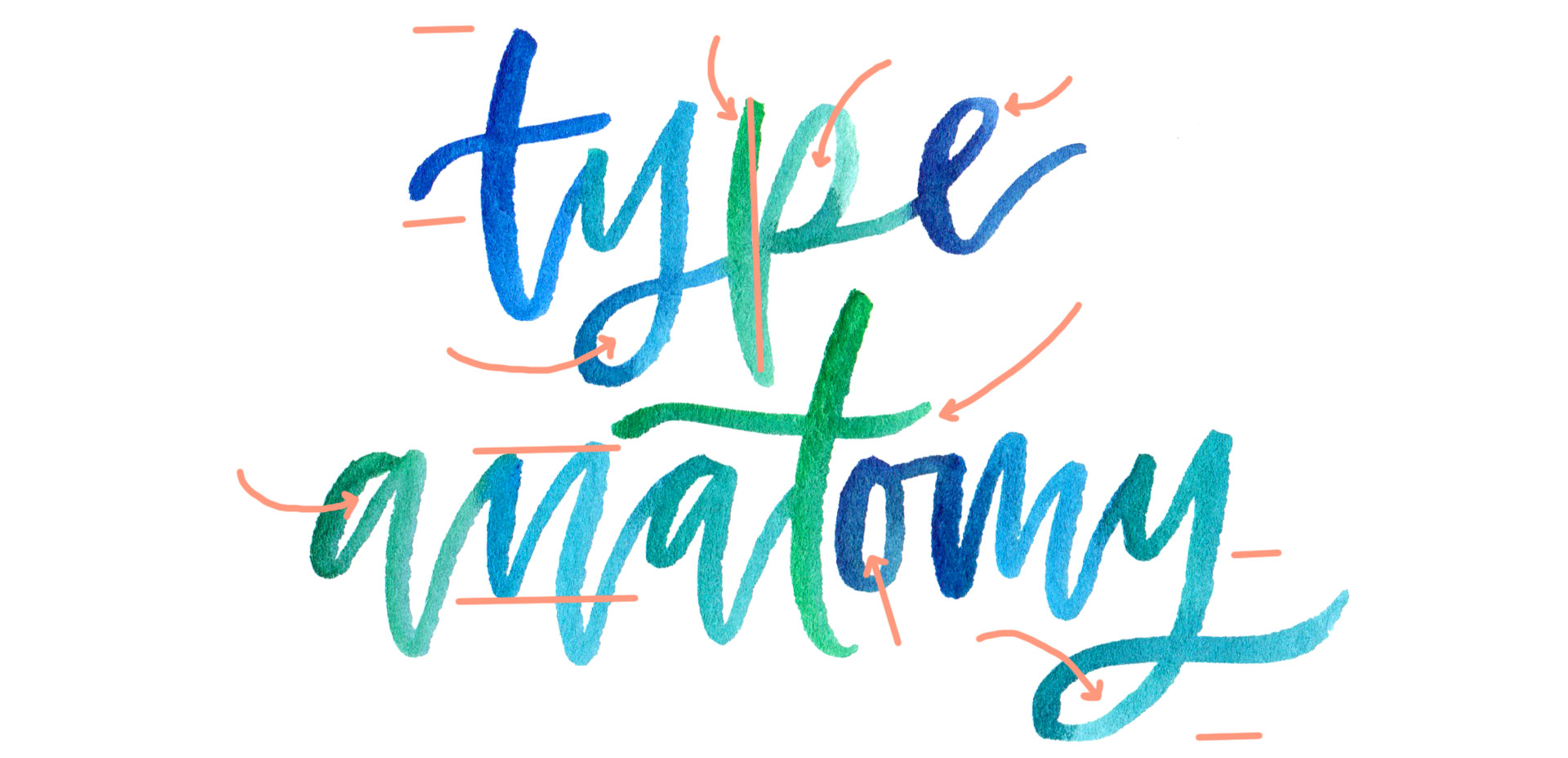
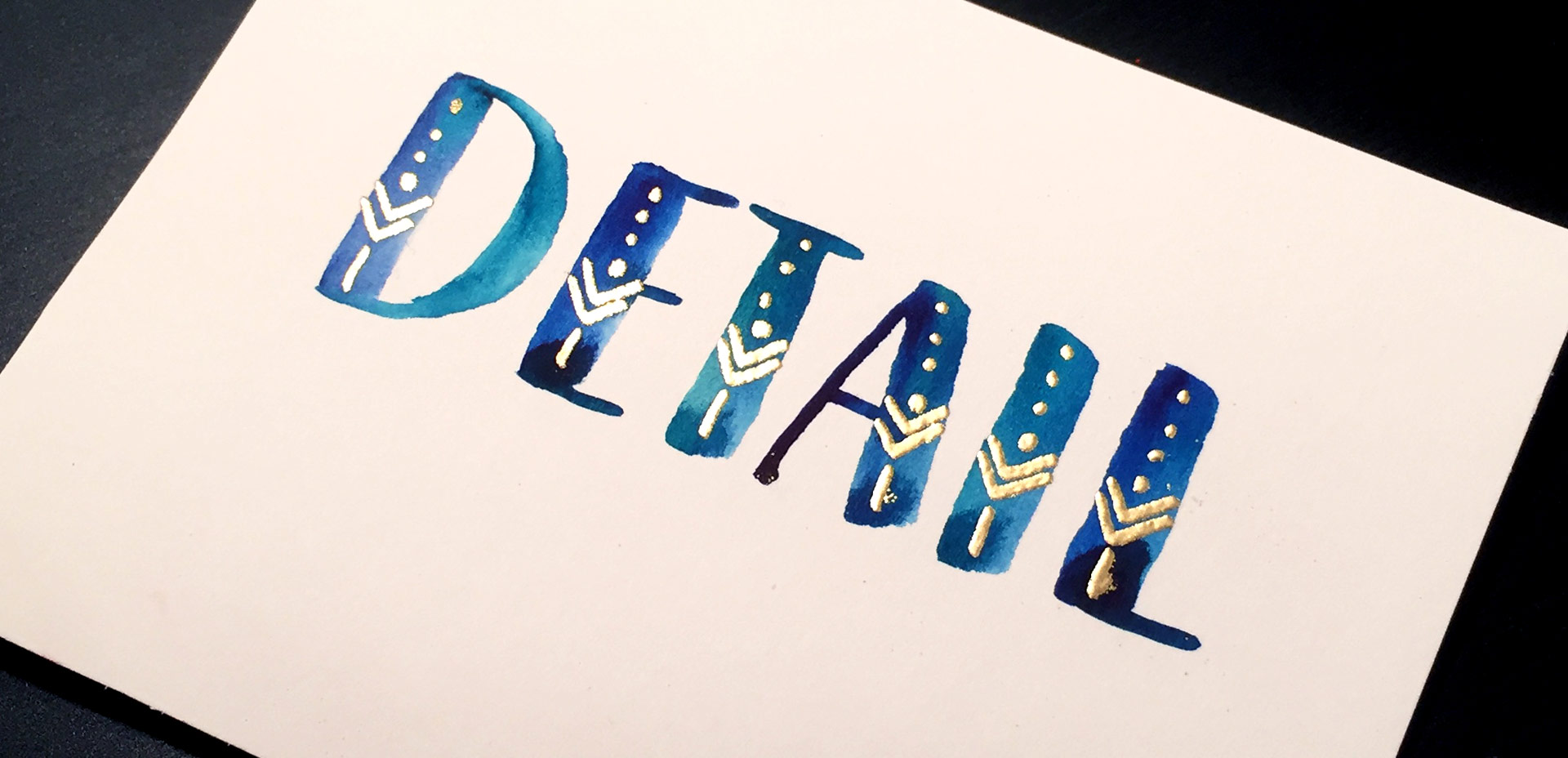
With the launch week of Brush Lettering with Watercolor coming to a close, I thought it would be fun to tie colorful letters into a quick tip design tutorial. And what better way to talk about type anatomy than getting colorful with it? 🙂 This is actually kind of perfect for hand letterers and graphic designers alike. For hand letterers, an intimate understanding of letterforms is essential, keeping qualities consistent for balanced, harmonious styles. For graphic designers, understanding style pairings and their character traits creates more strategic, thoughtful designs.

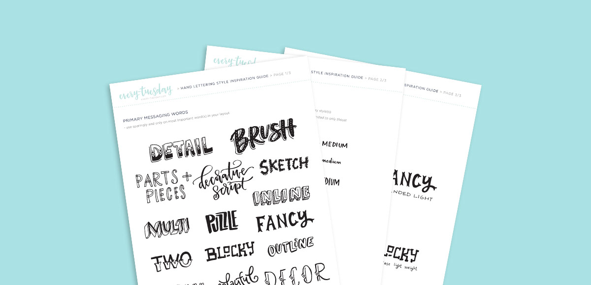
Over my (almost) 10 year career as a graphic designer, there’s definitely a short list of type characteristics that serve as an excellent base if you’re just starting. In this week’s video, I walk you through those base type anatomy qualities, with full descriptions throughout the video. Download the free cheat sheet below to reference later!

One of my favorite uses for the hand lettering I create is vectorizing it and using it digitally. When it’s digital, you don’t just have one copy anymore; you have unlimited copies. Unlimited copies leaves the door to digital and physical prints massively wide open. By taking a few simple steps, you can quickly digitize your lettering, clean it up in Illustrator and create a print ready file in a matter of minutes. Like I said, one of my favorite things 🙂 This week, I share my full process on how I do it by creating a hand lettered birthday card in Illustrator!

I think it’s pretty fair to say that diy embossing is reallllly popular right now. It’s easy to see why; First, there’s watching colorful powder stick magically to invisible ink. Next, there’s witnessing it look completely different (especially metallics) once heat is applied. The results look like they came from a pro print shop! I haven’t come across many videos of a watercolor/embossing combo, so it was time for that to change 🙂 I recently started applying embossing designs to my watercolor lettering and it makes for some really tactile + impressive outcomes.  This week I wanted to have some fun by sharing watercolor lettering with DIY embossing 3 ways. Everything used in the video listed with links below!

I am truly so flattered by the response to Lettering Layouts this week (it’s the #1 trending class on Skillshare as I type this!). I have loved, LOVED seeing everyone’s experiments they’ve shared either by tagging me on instagram or posting in the class. So much talent! To say a giant thank you, I wanted to share a little something extra to inspire any new layouts you may have up your sleeves: a hand lettering style inspiration guide!

Happy Tuesday! Today is one of my favorite kinds of Tuesdays, because I get to share a brand new class with you! I’m not going to lie, this class was a lot of work to prepare and record. There were 3 days where I was up until 5am putting every last detail in, so today, I’m breathing easier. 🙂 If you’ve followed along in past classes like Waterbrush Lettering Essentials and Bounce Lettering, you already have the perfect foundation for this one. Instead of a class focused on how to hand letter, this one is all about using your hand lettering.

Let’s talk about something that’s massively important, but often gets overlooked: type on a path in Illustrator. You’re probably already familiar with the ability to select any text and go effect > warp, but that makes editing your text later on pretty difficult. The truth is, most of graphic design is experimenting, altering and adjusting. Because of this, the need to go back and adjust previously warped text quickly is a big deal. Luckily, Illustrator makes it super easy to customize text appearance along a path with a few handy tools. Prepare to take your layouts to a whole new level with these options in this week’s tutorial! Oh, and just in case you need to reference these tips later, I made you a free cheat sheet, too 😉

There’s no doubt you’ve encountered it before: typography with a watercolor texture built in. A while back, I shared how to replicate this cool effect in Photoshop. Today, I want to share how easy it is to create watercolor typography in Illustrator using 3 different methods. If you saw last week’s tutorial, then you’ve already gotten a peek at one of them. 😉 But! If you don’t have a seamless watercolor pattern on hand, it’s still cake to create the same effect. I’ll even help you out by giving you a free texture from Watercolor Texture Kit Vol. 3 so you can follow along and start experimenting asap! Read on for everything you need to know to get started!

I’ve had a few requests on how to replicate the look of the incredible artwork by Eiko Ojala and I’m so excited to share my interpretation of it this week. This week’s tutorial is a little more advanced, but I have tutorials for every part I speed through and I’ve linked to all of them under the video if you’d like a more thorough explanation. This technique can be used for so many cool applications – logos, greeting cards, branding, web graphics, etc. We’ll start out in Illustrator creating our organic shapes and finish everything up in Photoshop, adding in shadows and textures to complete the layered letter look. See how it all comes together below!

I wanted to change things up a little this week and go super down to basics. The truth is, when it comes to learning, a lot of the times, I’m most inspired by just *watching* the thing happen. Seeing it take place, someone else’s process without all the nitty gritty little details along the way – just the ‘have-to-knows’ first. Maybe you’re like that too. On the chance you are when it comes to lettering, this week I want to go super simple and just share how I would do a basic lettered quote/phrase on the iPad – what I think about as I’m writing, what I’m paying attention to, and what I do to change course when maybe things aren’t going exactly how I like them. If this is something you’d like to see more of, let me know! I want to provide all I can on clearing up anything that might be holding you back 🙂 Full process below – and if you want to go further after this, my Intro to iPad Lettering course is located here. Let’s go!

GDPR Icon

Your Privacy Matters

We use cookies to customize and create content that’s most important to you. We’ll never share the info we collect.

View Privacy Policy