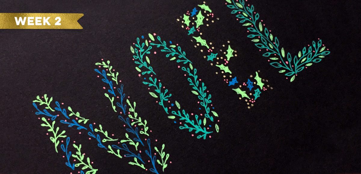
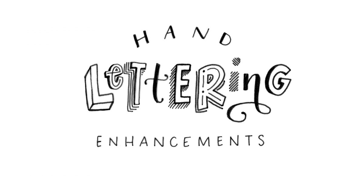
HomePosts Tagged "diy" (Page 5)

diy Tag

Welcome to week 4 of holiday hand lettering projects! If you missed the last three weeks, you can catch up here and here and here 😉 This is a 6 week lettering tutorial series with the goal of gaining new lettering tricks, learning about lettering supplies you might not have used before and creating something you can use/gift right away. Every week we build on the skills from the previous week, so if you need a refresher, be sure to rewatch any of the previous videos. Check back every Tuesday from now until December 12th for a new holiday themed lettering project! This week, we’ll create 3D block lettering embellished with simple decorative flourishes. Read on to see how!

Welcome to week 3 of holiday hand lettering projects! If you missed the last two weeks, you can catch up here and here 😉 This is a 6 week lettering tutorial series with the goal of gaining new lettering tricks, learning about lettering supplies you might not have used before and creating something you can use/gift right away. Every week we build on the skills from the previous week, so if you need a refresher, be sure to rewatch any of the previous videos. Check back every Tuesday from now until December 12th for a new holiday themed lettering project! This week, we’ll create decorative lettering by utilizing gel pens on top of black lettering that has a 3D feel to it. Read on to see how!

Welcome to week 2 of holiday hand lettering projects! If you missed last week’s project, pop over here to check it out! This is a 6 week lettering tutorial series with the goal of gaining new lettering tricks, learning about lettering supplies you might not have used before and creating something you can use/gift right away. Check back every Tuesday from now until December 12th for a new holiday themed lettering project! This week, we’ll create colorful and decorative NOEL lettering! Read on to see how 😉

Welcome to the first week of holiday hand lettering projects! This is a new tutorial series spanning 6 weeks, starting today. Every Tuesday, we’ll create a new holiday-inspired lettering project you can then use on your holiday stationery (like gift tags, greeting cards, homemade ornaments, etc.). The goal of this series is to gain some new lettering tricks, learn about lettering supplies you might not have used before and to create something you can use/gift right away. Since we’re starting in early November, you’ll have plenty of time to practice and prepare for December celebrations. I also have another surprise that comes with participating in these weekly projects below!

I’ve been breaking out my watercolors a bit more lately and have found myself painting a lot of autumn and winter themed illustrations. I thought I’d change things up a bit this week and share my method for painting an autumn watercolor branch. This is one of the first illustrations I learned how to paint and I love that there’s no pressure to get anything perfect. Add as many leaves, branches and organic curves as you’d like – there really is endless creative freedom here. We’ll go through the wet on dry technique, mix up custom pan set watercolors and talk about a few tips for painting leaves. This is the first Every-Tuesday watercolor painting tutorial – let me know if you’d like to see more in the future!

A couple weeks ago, I shared 3 tricks for creating unique grit textures. This week, I’m sharing how to create a gritty photoshop texture brush using a texture we created! This texture brush can be used for borders, backgrounds, illustrations and more (tutorial on those coming soon!). In the video, I share my scan settings and how I edit the texture before ever creating a brush with it. Once the texture is optimized, I share some of my favorite Photoshop texture brush settings. These are settings that you can easily implement into future texture brushes, too. This tutorial is perfect for beginners, so if you’re just getting started with Photoshop, be sure to read on to see it all!

My newest font, Skinny Jeans, just went live this week! I’ve been making a point to share process info for the fonts I make (here’s Espresso Roast), so that’s what this week is all about 🙂 Skinny Jeans is a font trio that includes the main script style, a caps style that pairs perfectly and a symbols font to add extra personality to layouts. The hand drawn + illustrated symbols also come as a vector file to make things quicker for those who work in Illustrator. This font is by far the most in depth of all I’ve created; it contains 30+ ligatures, alternates and extra features. In the video below, you’ll see what raw materials I used to initially hand letter the font, then the steps I took to make it a fully functioning font. Read on to see everything!

Grit textures are one of the quickest ways to add a handmade feel to digital art. By adding a little texture to edges, borders, blocks of color or even shadows, simulated depth and an organic feel are created. What’s even better is that it only takes a little effort to create and apply them. In this week’s tutorial, I’m sharing 3 of my favorite simple tricks for creating unique grit textures. In the coming weeks, I’ll also be sharing how to digitize and apply them to artwork. Let’s kick this off by breaking out some ink and experimenting!

In my online course, Lettering Layouts, we talk about how to pair different styles of lettering and creates beautiful, impactful messages with them. Sometimes it can be tough just coming up with some different lettering ideas, though! To make things a little easier, this week I’m sharing 10 super easy hand lettering enhancements anyone can do. We’ll slowly increase in complexity as we go along, but you’ll see quickly how easy they are to apply. I’ve also included a free pdf of everything we covered below 😉 All you need is a pen and/or pencil and some paper, so let’s get lettering!

If you love lettering and watercolors, you’ve probably come across the watercolor galaxy effect. Whether just as a beautiful texture, or incorporated into lettering, it’s eye catching. Made from a variety of cloud-like colorful textures, it’s further detailed with doodled stars. There’s nothing like creating this traditionally with watercolors, but you can achieve this same look in Photoshop. In this tutorial, I take you through my process of creating and applying this watercolor galaxy effect to lettering, all within Photoshop. This is a bit of an advanced tutorial, so we’ll move through things quicker and with less detail than usual since there’s a lot to cover. Let’s dive into this galaxy!

As much as I love having digital calendars at my disposal, there’s still something about things written in by hand. If you feel this way too, this tutorial’s for you. In this video (perfect for beginners), we’ll create a printable calendar that fits any 8.5″x11″ or A4 sized paper. We’ll be making use of some handy Illustrator tools and by the end, you’ll have a watercolor floral calendar design fully created using Illustrator. We’ll use a watercolor floral bouquet from my kit here, but I also have a free mini kit you can pick up below if you’d like 😉 Let’s get started!

I first realized how big of a deal enamel pins were when I worked on the Coca-Cola sponsorship of the 2014 Olympic Winter Games. The design studio I was working at had a giant collection of pins from past Olympic Games and they were incredible. Lately, I’ve been seeing them more and more and thought a tutorial on how to create the concept art for one would be fun. In this tutorial, I walk you through the exact steps I took when presenting enamel pin concepts to a client for approval. The goal was to give a general impression of how the pins would look once created. Once the client had approved them, our production director got in touch with a manufacturer who provided the info we needed to prepare production files. This video details the very first step of that process – read on to see!

GDPR Icon

Your Privacy Matters

We use cookies to customize and create content that’s most important to you. We’ll never share the info we collect.

View Privacy Policy