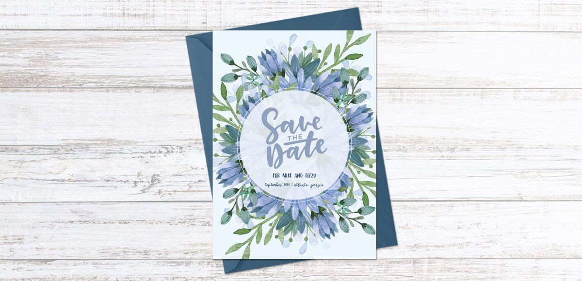
HomePosts Tagged "diy" (Page 6)

diy Tag

I’m so grateful for the kind feedback the watercolor floral save the date had a few months ago! I thought this week it would be fun to follow it up with a watercolor floral RSVP card in Adobe Illustrator. If you’re new to working with watercolor florals in Illustrator, you’ve come to the right place 😉 There’s a link below to my free watercolor floral mini kit and this tutorial is very beginner friendly. At the end of this video, you’ll be able to create a custom, print ready RSVP card ready for the mail. Read on to see how!

This week, we’re keeping things quick and easy with 3 simple pattern hacks applied to stationery borders in Adobe Illustrator: striped, chevron and polka dot. Borders in stationery design are a great tool to create focus on a message while still adding personality. With simpler projects, a seamless pattern swatch isn’t always needed and that’s where these pattern hacks come in 😉 Ideas for using these pattern stationery borders could be: shopping lists, memo pads/notepads and greeting cards. In this beginner friendly tutorial, we’ll utilize an offset path, the blend tool and stroke palette. See it all below!

Ever dreamed of creating your own hand lettered font? Actually typing with *your* letterforms? I promise there are fewer better feelings when it comes to loving lettering than that 😉 But where do you even begin? How do you create those initial letters so you can convert them into a font? While the topic of how to prepare your lettering for font making is covered extensively in my course, Learn Font Making, I wanted to share a bit of my process in this week’s tutorial. In this video, we’ll talk about how to prepare lettering traditionally (writing utensil + paper) so you get all the characters you need for your font. If you’d prefer to prepare lettering on an iPad instead, that’s covered specifically inside the course. For now, read on for the traditional method!

Whether you’re creating font or lettering styles that go together as a family or creating beautiful layouts with clear hierarchy, pairing type is important. When two styles are too similar to each other, it can cause visual confusion at first glance: what part do you read first? What styles feel most harmonious with each other? What will make my layout look great and communicate well? With a few tips in mind, those decisions can be much easier to make. Read on for my 3 simple tips for pairing type!

Last fall, I shared a video on 3 simple tricks for unique watercolor textures. To my surprise, it quickly became my most viewed video of all time (almost 1 million views as I type this!). Since integrating textures into my work is one of my favorite parts of design, I wanted to share another quick tip texture video. This week, we’ll be going over 3 simple tricks for unique acrylic textures. I first started creating acrylic textures when I made this paint streak typography tutorial (over 2 years ago!). After that, I posted this video on Instagram of another method, and most recently this one.  I love that I can keep things traditional if I’d like, but also that I can create digital work from these textures that still feels authentic, hand made and special 🙂 So, let’s get these going!

One of my favorite typography books is Shadow Type by Steven Heller + Louise Fili. I’ve broken the hardcover spine with all of the times I’ve paged through, sticky noted the tops of others and left it flat open, absorbing as much as possible. What’s most impressive is the consistency and creativity with all of that 3D type, perfectly executed by hand. I’m constantly reminded of how lucky we are to have a program like Adobe Illustrator, making things in seconds that once took hours. One shadow type project I’ve been working to perfect is dimensional signage typography. I love how the typography looks 3D and oftentimes has a long shadow, extending in the opposite direction. In this week’s tutorial, I’m sharing my method of creating that signage typography look using Illustrator!

I created something similar to this watercolor fireworks trick last year and I couldn’t stop thinking about it this year. It’s soooo easy, quick and really fun to create. In celebration of Independence Day here in the US (and the fact it lands on a Tuesday this year), today we’re going to create watercolor fireworks together 🙂 Grab your favorite watercolors, a waterbrush, a straw and let’s go!

Almost two years ago, I created some freelance lettering for a ‘spicy’ greeting card company called Get Feisty. One of the styles requested was what I call wave lettering, or lettering that looked like waves from far away. I hadn’t lettered in that layout style before, but it was a fun challenge figuring out my process for it. After a few (or 20+) tries, I had a solid process and it has become one of my favorite layout styles. In this week’s video, I’m sharing the exact process I use to create wave lettering. Read on for the simple materials and full video below!

A few weeks ago, I shared how to create this effect using an iPad with Procreate. This week, I wanted to share how easy it is to create typographic floating shadows in Adobe Illustrator, too! The method I use utilizes the blend tool and pathfinder palette and a few simple steps. This effect is perfect for headlines, special art projects or even signage. Read on to see it in action!

This week, I thought I’d go completely analog with a DIY watercolor ribbon Father’s Day card. I love taking handmade creations digital, but every now and then – especially for sentimental holidays, you can’t really beat 100% handmade 😉 With Father’s Day coming in less than a week, you’ll still have time to seal this in an envelope, stamp it up and get it in a mailbox in time. So, let’s get this card going; all the instructions, materials and full video are below!

First off, I want to tell you this isn’t the sexiest tutorial you’ll ever watch, but it can be a giant time saver and really make you look like you know your stuff. So, stick with me, because this is pretty handy to know: list format data merge in InDesign (sorry if that was a little eek-worthy to read, but you were warned 😉 ) To accompany our save the date postcard from last week, this week we’ll create a wedding seating chart to go with the big day. Traditionally, data merge is used to automate large amounts of data into multiple pages, but it’s different here: we’re placing lists of data onto one page, so there are a couple small tweaks that need to be made. I promise this is super simple and you’ll be glad to have this in your designer arsenal when you see what it can do.

A few years ago (ok, more like 8) when I started creating templates for others to use online, wedding templates were one of the first kinds I made. I loved putting together a stationery set that felt like it belonged together, but altering each piece slightly to still feel special. I realized – here we are in May, and it has been since 2014 since I created a wedding stationery tutorial. With my new watercolor leaves and florals kit now available, it makes wedding stationery that much easier and quicker to put together (grab a free mini kit below!). In this week’s tutorial, we’ll create a save the date postcard together in Illustrator which will be all ready to print at home, or send off for printing when we’re finished. Read on for all the details!

GDPR Icon

Your Privacy Matters

We use cookies to customize and create content that’s most important to you. We’ll never share the info we collect.

View Privacy Policy