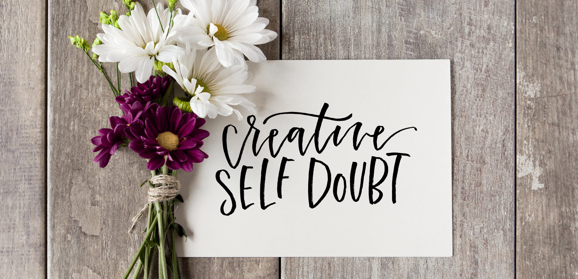
HomePosts Tagged "graphic design" (Page 12)

graphic design Tag

Ever battled self doubt as a graphic designer or as a creative in general? I’m going to go ahead and assume the answer is yes to that one 😉 It’s definitely one of the most common emotions we go through on our creative journeys, though when we’re in the thick of it, it’s easy to feel like we’re the only ones. If you’ve ever thought about throwing in the towel, wondered if this is the right path, or thought that maybe you just aren’t creative enough to keep chasing the dream, this post is for you.

Welcome to the first holiday tutorial of the season! To kick things off, I thought it would be fun to create custom holiday gift wrap in Adobe Illustrator. Since gift wrap is essentially a repeating pattern, we’ll be walking through all of the steps of a seamless pattern using the pattern tool. Be sure to pick up last week’s free holiday vectors to follow along exactly! This pattern tutorial is a little different; not only will we create a seamless swatch, I’ll also share how to apply any background color to your pattern quickly (without re-entering the pattern tool)! Once our pattern is complete, we’ll export it and use an online service to upload and customize our gift wrap. By the end of the video, you’ll have everything you need to create your pattern and also get your custom holiday gift wrap printed for real! Everything you need included below!

Happy November! This year is seriously cruising by. Before we know it, we’ll need to start sending out holiday cards, and if you’re feeling ambitious, diy’ing some printable design work. I’ve got a bunch of holiday design tutorials planned, so I want to make things super easy on you this year. This holiday vector pack includes all the vectors you’ll need to create every upcoming tutorial! These come as vector-only since we’ll be working mostly in Adobe Illustrator. Working in Illustrator will allow us to use our artwork at any size we please, without ever losing quality or resolution. Get a head start with any projects you have in progress and grab all 33 unique vectors below!

Last week, we created a realistic foil stamp effect using only illustrator and a seamless foil texture. This week, we’re borrowing some of the same tips, but simplifying. If you don’t have a texture on hand, but still want to add an element of cool, a letterpress effect is a great option. The letterpress effect simulates the impression a polymer plate makes on paper when it’s pressed into it. Letterpress has become increasingly popular over the last 5 years, but fun fact: letterpressing was never meant to be a final print effect. Letterpressing first began as a ‘test’ print before metal plates were developed which create stronger, deeper (and more expensive) impressions. In this week’s tutorial, adjust the settings for however strong of an impression you’d like as we create a letterpress effect entirely in Illustrator.

Today’s the last Thursday in October, so it’s time for your free November 2016 desktop wallpapers! This month’s wallpaper was hand lettered on an iPad Pro using an Apple pencil. Here are a few more details: the glitter texture is from the Procreate Metallic Texture Kit. The brushes used were a slightly modified (default) studio pen and brush pen in Procreate. This download includes the wallpapers in two common resolutions: 1280x1024px and 1920x1080px, with and without dates. I’ve left the year off of the ‘no-dates’ versions, so you can use it for any November in the future, too!

This past January, we created a foil stamp effect in Photoshop, and I’ve recently had a few requests on how to accomplish the same look in Illustrator. With the holidays fast approaching, now you’ll have plenty of time to use it in Illustrator, too! Not only can this look be applied to typography like in the example, but you can also export it as a graphic style. Exporting graphic styles allows the foil stamp effect in Illustrator to be applied to any vector element, as well. Pretty powerful stuff. At the end of the video, I share how to export those graphic styles to use them in new documents or share them with others. Read on to see it all!

Three years ago this week, before I ever thought a full time design blogger was something I’d be, I published my first blog post on Every-Tuesday. The post was a halloween character free vector set and it wasn’t in my style at all. I’m also far from an Illustrator, but I decided I was going to blog consistently and it was almost Halloween, so why not. Let’s put up some Halloween vectors – there’s a way to start a blog. That’s actually kind of funny.

I’m certainly not proud of that particular post, but I’m proud that I started, regardless of not being quite sure where I was going to go with my concept of consistent Tuesdays. Here’s a little background on why that post and this blog began in the first place, along with 3 very unexpected truths that I’ve learned by being a full time design blogger.

With the launch week of Brush Lettering with Watercolor coming to a close, I thought it would be fun to tie colorful letters into a quick tip design tutorial. And what better way to talk about type anatomy than getting colorful with it? 🙂 This is actually kind of perfect for hand letterers and graphic designers alike. For hand letterers, an intimate understanding of letterforms is essential, keeping qualities consistent for balanced, harmonious styles. For graphic designers, understanding style pairings and their character traits creates more strategic, thoughtful designs.

Over my (almost) 10 year career as a graphic designer, there’s definitely a short list of type characteristics that serve as an excellent base if you’re just starting. In this week’s video, I walk you through those base type anatomy qualities, with full descriptions throughout the video. Download the free cheat sheet below to reference later!

If you’ve been here for any length of time, then you know I  have a slight obsession with watercolor. Part of it is mixing beautiful color combinations together, and another is creating abstract and unique textures. Creating unique textures allows you to then use them in designs, producing an outcome no other person is capable of replicating – ever. And that makes everything even more special. As you might imagine, I’ve spent many hours experimenting with watercolors and this week I want to let you in on 3 simple tricks to create unique watercolor textures of your own. It doesn’t matter which kind of watercolors you have on hand, either – these tricks will work with em all 😉

Today’s the last Thursday in September, so it’s time for your free October 2016 desktop wallpapers! This month’s wallpaper was hand lettered with the super-fun-to-play-with FineTec metallic watercolors. The paper is Neenah Astrobrights Eclipse Black, which actually holds up perfectly with the metallics. FineTecs are naturally on the thicker side, so they sit right on top of cardstock like they were meant to be together 🙂 . This download includes the wallpapers in two common resolutions: 1280x1024px and 1920x1080px, with and without dates. I’ve left ‘2016’ off of the ‘no-dates’ jpgs, so you can use this for any October in the future, too!

One of my favorite uses for the hand lettering I create is vectorizing it and using it digitally. When it’s digital, you don’t just have one copy anymore; you have unlimited copies. Unlimited copies leaves the door to digital and physical prints massively wide open. By taking a few simple steps, you can quickly digitize your lettering, clean it up in Illustrator and create a print ready file in a matter of minutes. Like I said, one of my favorite things 🙂 This week, I share my full process on how I do it by creating a hand lettered birthday card in Illustrator!

I’ve only recently started incorporating Illustrator texture brushes into my work, and I regret not doing it sooner! Illustrator texture brushes offer so much hand made feel with such little effort, you almost feel like a magician 😉 To get started, all you need is any kind of vector texture like this set of inky brush strokes or these mini grit textures (both free!). From there, we convert them into Illustrator art brushes with specific settings and we’re done! This will be such a great addition to your regular workflow if you love including extra texture into your work. For the tutorial, we’ll create some inky and gritty typographic drop shadows in just a few quick minutes. Read on to see it all!

GDPR Icon

Your Privacy Matters

We use cookies to customize and create content that’s most important to you. We’ll never share the info we collect.

View Privacy Policy