HomePosts Tagged "graphic design" (Page 9)

graphic design Tag

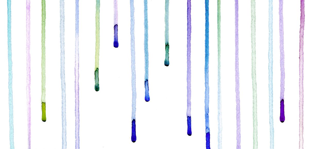
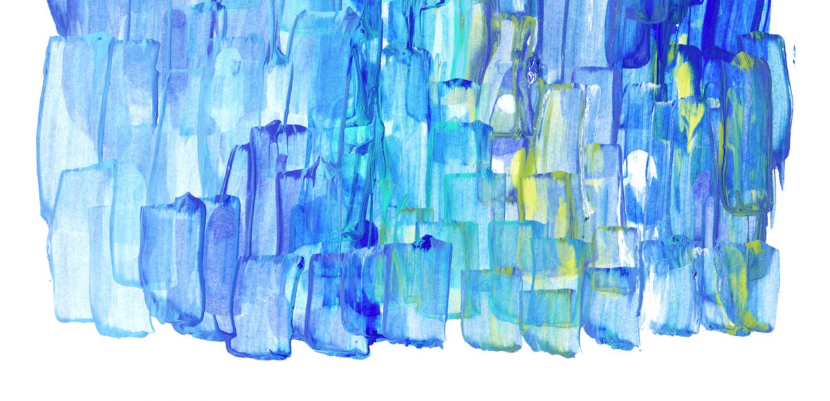
It’s the last Thursday in May, which means it’s time for your free June 2017 desktop wallpapers! I’ve been wanting to play with acrylics a bit more lately, so this month’s wallpaper was an experiment of color mixing and texture. I went with a blue/green/teal palette for Father’s Day this month, keeping a balanced mix of all (without getting too muddy) throughout. Let me know if you’d like a tutorial on how I made the paint texture and I’ll put one together 😉 Once created (and dry), I scanned the artwork into the computer, color adjusted in Photoshop, then added the dates using my font, Miss Magnolia.

The download includes the wallpapers in two common resolutions: 1280x1024px and 1920x1080px, with and without dates. I’ve left the year off of the ‘no-dates’ versions, so you can use it for any June in the future, too!

Happy Tuesday, friends! Today we’re jumping into procreate with some tips on how you can quickly improve your iPad lettering by using the skeleton technique and a mono weight brush. The Skeleton Technique is a trick that, when used, can give your lettering dramatic results fast. We’ll start the tutorial by creating our own mono weight brush by altering a default/standard brush in procreate. Then, I’ll share my process for utilizing the skeleton technique, along with a few examples to get you started. Read on to see how!

I actually stumbled upon this effect while playing around in Photoshop with this Instagram post awhile back. It felt like it needed a little something extra, and after playing around with some settings, I was able to get a watercolor glitter effect I really loved. I had completely forgotten about it, then that instagram post randomly appeared in my pinterest feed the other day. That’s when I knew I had to create a tutorial 🙂 If you’re not ready to use your own watercolor lettering yet, I’ve included another option for achieving the same effect using your favorite fonts. Read on to see it all!

While browsing pinterest last week, I came across this ‘A’ and I knew I had to recreate it digitally. I loved the way the shadows ‘stair stepped’ the different sides, and how those shadows made the letter feel raised. I also liked the fact that I could integrate a bunch of colors without it seeming too busy, and that I could put my own spin on it with some glitter textures. In this week’s tutorial, I’m sharing my process for creating this layered letter effect, using both Illustrator and Photoshop. You can stay in Illustrator the entire way if you’d like, but I discuss my reasons for hopping into Photoshop to finish things off. Read on to see it all!

It’s time for your free May 2017 desktop wallpapers! This month’s (May flowers) wallpaper was created using this Winsor & Newton watercolor pan set with a no. 1, no.4 + no.8 round brush on this Canson watercolor paper. I then scanned the individual flower + leaf elements, enhanced them and cut them out in Photoshop using the methods from this course (vid no.7 covers cutting them out). I hand lettered ‘May’ and applied it to the center within Photoshop, then added the dates using my font, Miss Magnolia.

The download includes the wallpapers in two common resolutions: 1280x1024px and 1920x1080px, with and without dates. I’ve left the year off of the ‘no-dates’ versions, so you can use it for any May in the future, too!

Happy Tuesday! It’s been a little while since we made some iPad lettering, so this week we’re creating floating shadows in Procreate. I’ve seen this effect referred to as ‘off shade’ before, but I’ve always thought of them as floating shadows. Essentially, it’s a drop shadow that’s disconnected, or there’s a space between your lettering and the shadow itself. I love how simple this effect is, but also how it adds that cool factor/semi 3D look right away. See how to apply this exact effect to your lettering below!

We have ALL been there. Days, weeks, or projects where there’s just nothing to grip onto upstairs. You scour the internet for inspiration, create mind maps and doodle out ideas, but find them all predictable; maybe even a little cliché. You start to question if creativity will ever locate you again, or worse – whether you ever had it to begin with. Oh, and this helpless feeling of creative block always happens at *the* worst possible time. Because it just wouldn’t make sense otherwise. Obviously.

So what can you do? Read on for 5 tips Spence and I have relied on throughout our creative careers to lift ourselves out of that inevitable rut.

Jamie got in touch with me a few weeks ago, asking how to recreate the letters in this image. I loved that idea, though I had a bit of trouble tracking down the original source. I also wasn’t totally sure what to call this look, so we’re going with ‘pattern letters’ 😉

Essentially, we have letters with a multiply blend mode (so you end up with three colors including the overlap), plus a pattern element integrated into one of the strokes of the letter. This creates a semi-dimensional look, plus a beautifully colored one – perfect for modern headlines (or even logos!). Read on to create your own!

It’s time for your free April 2017 desktop wallpapers! This month’s (April showers) wallpaper was created using this Winsor & Newton watercolor pan set to carefully drip different colors on this Canson watercolor paper. I then scanned it and enhanced the colors using photoshop, then typeset April + the dates using my font, Miss Magnolia.

The download includes the wallpapers in two common resolutions: 1280x1024px and 1920x1080px, with and without dates. I’ve left the year off of the ‘no-dates’ versions, so you can use it for any April in the future, too!

I secretly love creating tutorials that appear more difficult than they actually are. This week’s tutorial is exactly that, but also perfect for beginners with a really cool outcome. In this tutorial, we intertwine text and vector elements to draw attention to our messaging and make it visually striking at the same time. Read on for all the details!

Happy Tuesday! I know we’ve been a little Illustrator crazy over here, but it’s hard not to love a program that has so many rescalable benefits! However! I definitely have not forgotten about Photoshop, so today I’ve got a video that I think will really help with your black and white photo enhancements. I’ve got two options for you this week: enhancing existing black and white photos, and best practices for converting a color photo into a black and white one. There are a few *really* simple steps you can take to bring them more to life, and this tutorial is perfect for beginners! Read on to get started with your own!

GDPR Icon

Your Privacy Matters

We use cookies to customize and create content that’s most important to you. We’ll never share the info we collect.

View Privacy Policy