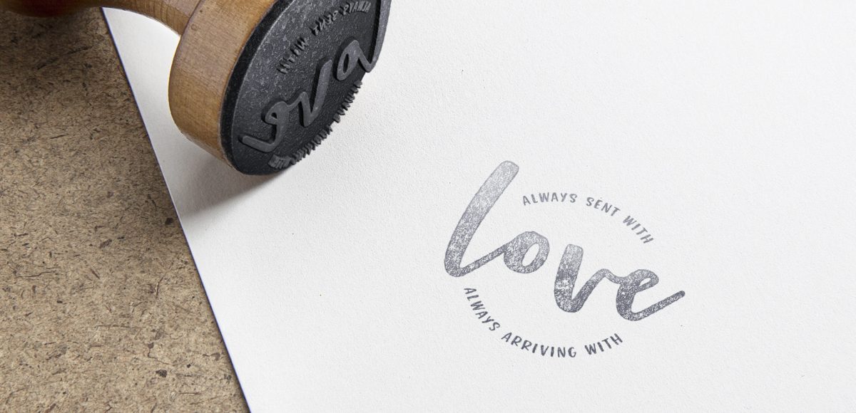
HomePosts Tagged "illustrator" (Page 2)

illustrator Tag

A while back, I shared how to type along a path in Illustrator, but what if that path is circular or closed? How to you get the text to run perfectly along the outside or inside of the circle? And if you start on one side, how do you nudge it just slightly without ruining everything? These are some questions that evaded me longer than they should have when I was starting out. Circular text is important! It’s great for logos, icons, stickers and custom rubber stamps just to name a few. Read on to master circular text in Illustrator and never wonder again!

You may have seen this style of lettering floating around instagram and created in Procreate on an iPad. In this week’s tutorial, I share how to create the same effect, but in Illustrator. By using Illustrator, everything can be infinitely rescaleable since it’s vector-based. We’ll utilize some features you may not be aware of that you can use for future work, too. This is a slightly advanced tutorial, so the pace is a bit quicker. If you’re new to Illustrator, allow some extra time (or check out some beginner tutorials first). Read on to create colorful gradient lettering in Adobe Illustrator!

Can you believe Valentine’s Day is next week?! If you’d like to DIY this year, this watercolor florals Valentine’s Day card in Adobe Illustrator can be created on a lunch break šŸ˜‰ In this week’s tutorial, we create a quick and simple vector heart, then surround it with watercolor florals and a radial gradient background. It’s a print ready file, so you’ll be good to go for printing at home from start to finish. If you’re new to working with digital watercolor florals, there’s a free mini kit below to get you started!

New Year’s Eve is less than a week away! To celebrate, I thought I’d cheers you Every-Tuesday style with a couple of cocktail glasses created in Adobe Illustrator. This tutorial is very doable if you’re a beginner, but the pace is a little quick, so just a head’s up. We’ll be in Illustrator CC for this one since we’re using the live corners option for smooth contours on our glasses. If you’re not using CC, this can still be done, but you’ll want to visit your appearance palette > stylize > round corners. Ready to get started? Full video + all the colors used are below!

Before we hit the end of the year, I was brainstorming ideas for winter themed illustrations, and mittens seemed perfect. I love how easy they are to make your own: design/decoration, shape and color! In this beginner-friendly (but some prior knowledge will be helpful) tutorial, we create a pair of cute winter mittens in Adobe Illustrator. Follow exactly or edit them to make em your own! Illustrator CC is recommended since we make use of some new features to speed up the workflow, but the result is still achievable in older versions. Read on to see how!

As much as I love having digital calendars at my disposal, there’s still something about things written in by hand. If you feel this way too, this tutorial’s for you. In this video (perfect for beginners), we’ll create a printable calendar that fits any 8.5″x11″ or A4 sized paper. We’ll be making use of some handy Illustrator tools and by the end, you’ll have a watercolor floral calendar design fully created using Illustrator. We’ll use a watercolor floral bouquet from my kit here, but I also have a free mini kit you can pick up below if you’d like šŸ˜‰ Let’s get started!

I first realized how big of a deal enamel pins were when I worked on the Coca-Cola sponsorship of the 2014 Olympic Winter Games. The design studio I was working at had a giant collection of pins from past Olympic Games and they were incredible. Lately, I’ve been seeing them more and more and thought a tutorial on how to create the concept art for one would be fun. In this tutorial, I walk you through the exact steps I took when presenting enamel pin concepts to a client for approval. The goal was to give a general impression of how the pins would look once created. Once the client had approved them, our production director got in touch with a manufacturer who provided the info we needed to prepare production files. This video details the very first step of that process – read on to see!

I’m so grateful for the kind feedback the watercolor floral save the date had a few months ago! I thought this week it would be fun to follow it up with a watercolor floral RSVP card in Adobe Illustrator. If you’re new to working with watercolor florals in Illustrator, you’ve come to the right place šŸ˜‰ There’s a link below to my free watercolor floral mini kit and this tutorial is very beginner friendly. At the end of this video, you’ll be able to create a custom, print ready RSVP card ready for the mail. Read on to see how!

This week, we’re keeping things quick and easy with 3 simple pattern hacks applied to stationery borders in Adobe Illustrator: striped, chevron and polka dot. Borders in stationery design are a great tool to create focus on a message while still adding personality. With simpler projects, a seamless pattern swatch isn’t always needed and that’s where these pattern hacks come in šŸ˜‰ Ideas for using these pattern stationery borders could be: shopping lists, memo pads/notepads and greeting cards. In this beginner friendly tutorial, we’ll utilize an offset path, the blend tool and stroke palette. See it all below!

One of my favorite typography books is Shadow Type by Steven Heller + Louise Fili. I’ve broken the hardcover spine with all of the times I’ve paged through, sticky noted the tops of others and left it flat open, absorbingĀ as much as possible. What’s most impressive is the consistency and creativity with all of that 3D type, perfectly executed by hand. I’m constantly reminded of how lucky we are to have a program like Adobe Illustrator, makingĀ things inĀ seconds that once took hours. One shadow type project I’ve been working to perfect is dimensional signage typography. I love how the typography looks 3D and oftentimes has a long shadow, extending in the opposite direction. In this week’s tutorial, I’m sharing my method of creating that signage typography look usingĀ Illustrator!

Happy Thursday! Today I have an awesome gift to share with you! My friends at Vecteezy put together an incredible set of 8 seamless ink textureĀ patterns just for Every-Tuesday readers! I got so excited after I receivedĀ them that I started playing around with them right away (see below). This free set comes not only as ai files, but eps files, psd files, a photoshop pat file *and* png files. Instructions on how to use them + ideas for use are allĀ below!

First off, I want to tell you this isn’t the sexiest tutorial you’ll ever watch, but it can be a giant time saver and really make you look like you know your stuff. So,Ā stick with me, because this is pretty handy to know: list format data merge in InDesign (sorry if that was a little eek-worthy to read, but you were warned šŸ˜‰ ) To accompany our save the date postcard from last week, this week we’ll create a wedding seating chart to go with the big day. Traditionally, data merge is used to automate large amounts of data into multiple pages, but it’s different here: we’re placing lists of data onto one page, so there are a couple small tweaks that need to be made. I promise this is super simple and you’ll be glad to have this in your designer arsenal when you see what it can do.

GDPR Icon

Your Privacy Matters

We use cookies to customize and create content thatā€™s most important to you. Weā€™ll never share the info we collect.

View Privacy Policy