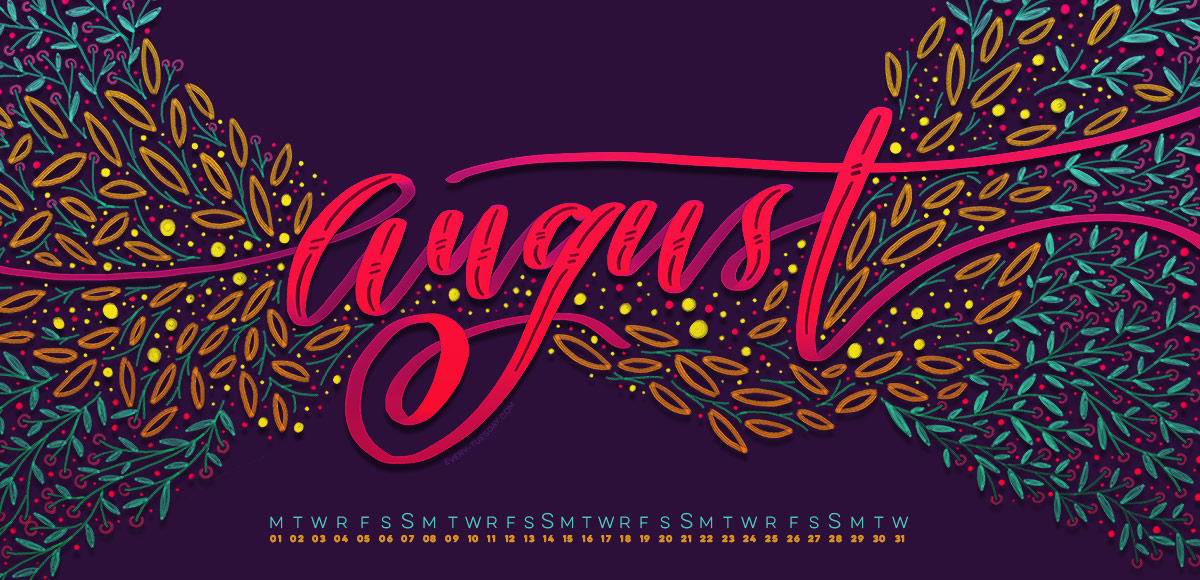
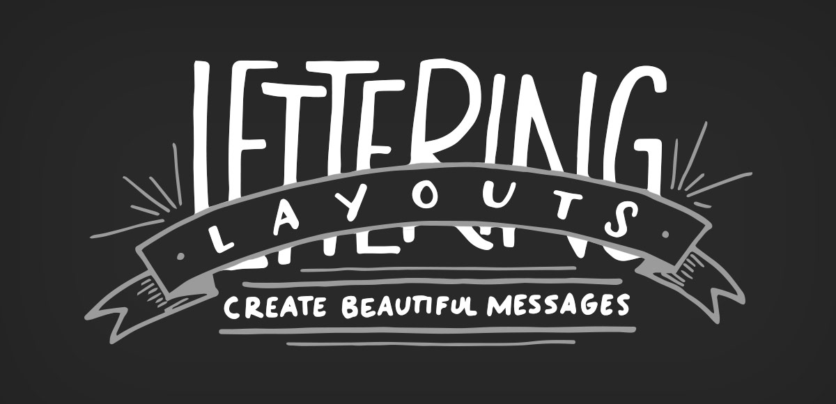
Home2016 (Page 4)

August 2016

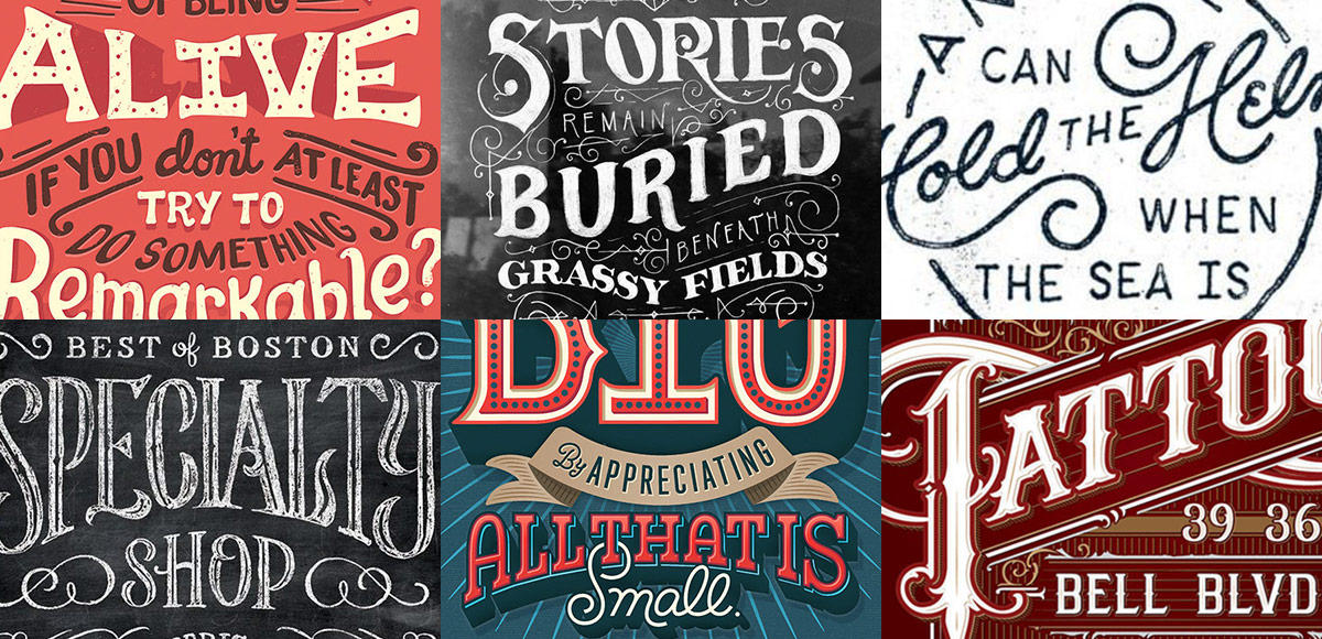
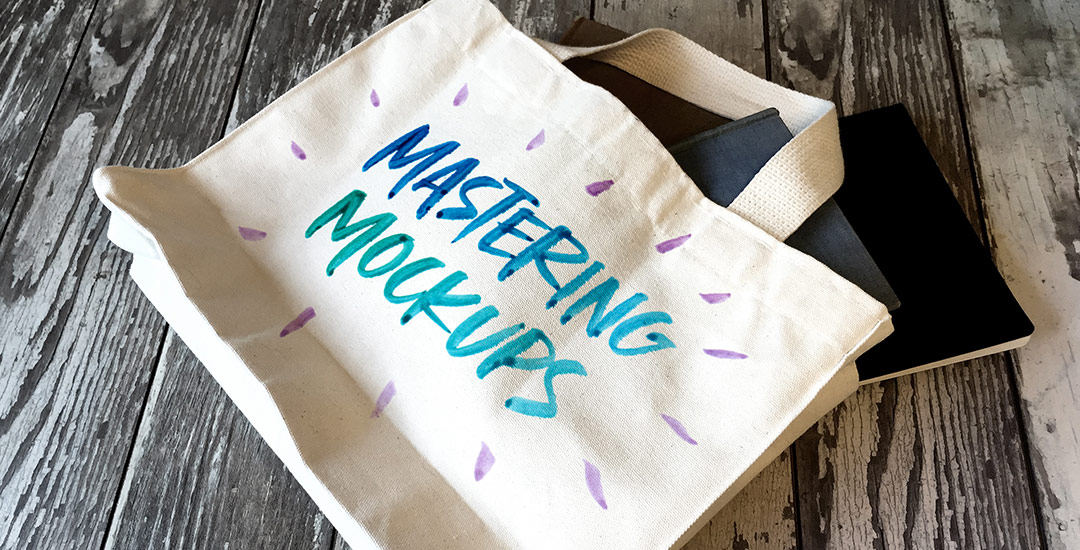
Happy Tuesday! Today is one of my favorite kinds of Tuesdays, because I get to share a brand new class with you! I’m not going to lie, this class was a lot of work to prepare and record. There were 3 days where I was up until 5am putting every last detail in, so today, I’m breathing easier. 🙂 If you’ve followed along in past classes like Waterbrush Lettering Essentials and Bounce Lettering, you already have the perfect foundation for this one. Instead of a class focused on how to hand letter, this one is all about using your hand lettering.

This coming Monday, I’ll be publishing my next Skillshare class, Lettering Layouts. Since we went over typing on a path in Illustrator on Tuesday, I thought it’d be fun to mix the concept of custom baselines with purely typographic layouts. The results are pretty incredible and can for sure seem intimidating to try yourself. This week, on top of a roundup of 6 stunning typographic layouts, I’m breaking each layout down. By doing this, it’s far easier to see how each layout was achieved and how you can begin incorporating similar methods, techniques and design elements into your own layouts moving forward. If you’ll be joining me in Monday’s class, this post is a big head start. Read on for more!

Let’s talk about something that’s massively important, but often gets overlooked: type on a path in Illustrator. You’re probably already familiar with the ability to select any text and go effect > warp, but that makes editing your text later on pretty difficult. The truth is, most of graphic design is experimenting, altering and adjusting. Because of this, the need to go back and adjust previously warped text quickly is a big deal. Luckily, Illustrator makes it super easy to customize text appearance along a path with a few handy tools. Prepare to take your layouts to a whole new level with these options in this week’s tutorial! Oh, and just in case you need to reference these tips later, I made you a free cheat sheet, too 😉

There’s no doubt you’ve encountered it before: typography with a watercolor texture built in. A while back, I shared how to replicate this cool effect in Photoshop. Today, I want to share how easy it is to create watercolor typography in Illustrator using 3 different methods. If you saw last week’s tutorial, then you’ve already gotten a peek at one of them. 😉 But! If you don’t have a seamless watercolor pattern on hand, it’s still cake to create the same effect. I’ll even help you out by giving you a free texture from Watercolor Texture Kit Vol. 3 so you can follow along and start experimenting asap! Read on for everything you need to know to get started!

Since today is the last Thursday of July, it means it’s time for your free August 2016 desktop wallpapers! This month you could say I went just a little bit overboard, but if you like a leafy doodle explosion on your screen, then it’s probably the perfect amount. 🙂 This was created on an iPad Pro with the Apple Pencil using the Procreate app, then exported and edited a little further in Photoshop. More on iPad lettering/doodling here!

I’ve been creating more patterns in the last year than I ever have before. Patterns are such a wonderful tool to add personality quickly to designs without a ton of effort, or overthinking. One of the best parts: they can be added to backgrounds, text and design elements with just a click of a button in both Photoshop and Illustrator. Say you have a Photoshop pattern, maybe a watercolor texture pattern, like we created in this tutorial. If you’d like to use it as a pattern swatch in Illustrator, how do you convert that Photoshop pattern file? In this tutorial, we go step by step on how to convert any Photoshop pattern into an Illustrator pattern swatch in a few quick steps. Read on for everything you need to know!

I want to start by saying a gigantic THANK YOU! for all of your kind comments from Tuesday’s tutorial (it even got a shout out from Adobe!). Spence and I have been doing some serious planning these days to make your experience here as best as it can be. The first baby step was implementing the new keyboard shortcuts on videos, a Tuesday Tips section and easy-to-pin images. But, that’s just the beginning. 😉 I can’t wait to share some of the other new ideas we’re planning to implement in the months and year to come!

Until then, if you’re a little short on list-designing time, I wanted to give away the design created in the tutorial this week as a free printable in 3 color schemes. There are 2 of each color per sheet, so you can print them all, or just print the color you like best 😉 Download link and preview images below!

To learn how to create your very own digital planner, check out this tutorial here!

There’s something that feels soooo good about crossing off items on a to do list. Having a written list keeps me on track every day of the week. Most times, I grab a scrap sheet of paper and bullet my to-do’s out, but it’s never quite as satisfying as when they’re written on a custom design. In this week’s video tutorial, we’ll create our own designed to do list from scratch, perfectly prepared for printing in a few quick and easy steps, so you can start crossing items off to your heart’s desire 😉 All of the steps below!

Happy Thursday! To celebrate the launch of Mastering Mockups this week, I thought I’d throw in another little extra bonus (did you catch the free lesson from the class in Tuesday’s video?). If you like putting your calligraphy or artwork on stationery, this week’s freebie was made just for you! With just a couple of clicks (full written step-by-step on using the file below!), you can place your artwork on this greeting card, just like in the preview image, in less than a minute! Use this for your own product sell pages or social media posts to get your work noticed quickly – grab the file below!

Happy Tuesday! I’m so excited I get to bring my newest online class to you this week, Mastering Mockups! In the class, we take original artwork, apply a little photoshop trickery, and put that artwork on products which look convincingly real. This is the perfect sales tool if you’re a seller on Etsy and need better product photography, if you’re a freelancer who wants to impress and convince your client to approve the artwork you created for them, or if you’d like to level up your design portfolio making fictitious projects come to life. You can also use the class’s techniques to create social media posts, blog images, digital product sales pages and more. Your enrollment in the class gets you all 4 base photos used in the class for free. With those photos, you’ll be able to follow along, completing every step as we go 😉

Keeping with tradition, I’m sharing the class trailer today, along with a bonus lesson from the class. In this lesson, we’ll create a single use, social media mockup. Are you ready to mock?! Everything below!

It’s been a little while since I shared a freebie texture, so today I’m sharing some ink textures! I started using these rolled ink textures in my artwork a while ago, the most recent example being this one to show off Tuesday Script. I’ve even masked these into typography using the same method as watercolor typography for some really nice textured type results. If nothing else, they are sooooo fun to play around with and add that little extra handmade feel to any kind of artwork. The best part? Every texture comes as a vector ai file for versions of Illustrator, CS3 or newer PLUS every texture comes as a transparent png, so it’s cake to use with any other kind of software 😉 Preview images + download link below!

GDPR Icon

Your Privacy Matters

We use cookies to customize and create content that’s most important to you. We’ll never share the info we collect.

View Privacy Policy