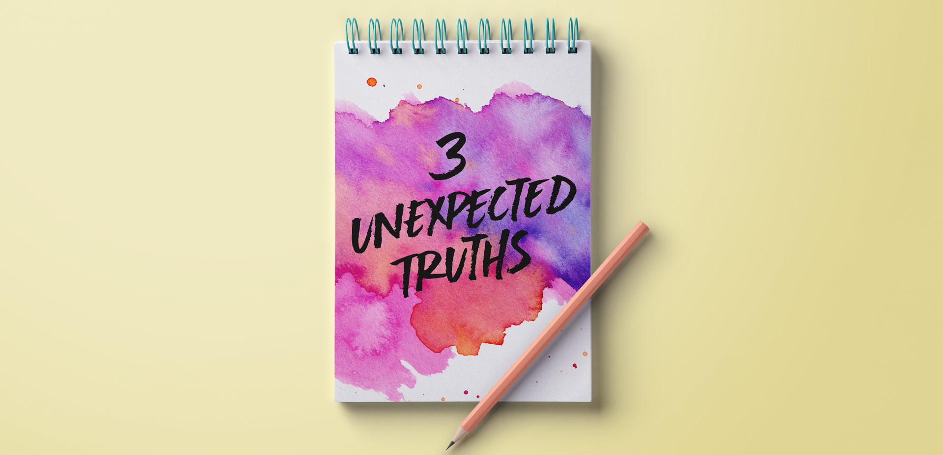
HomePosts Tagged "tips" (Page 2)

tips Tag

Three years ago this week, before I ever thought a full time design blogger was something I’d be, I published my first blog post on Every-Tuesday. The post was a halloween character free vector set and it wasn’t in my style at all. I’m also far from an Illustrator, but I decided I was going to blog consistently and it was almost Halloween, so why not. Let’s put up some Halloween vectors – there’s a way to start a blog. That’s actually kind of funny.

I’m certainly not proud of that particular post, but I’m proud that I started, regardless of not being quite sure where I was going to go with my concept of consistent Tuesdays. Here’s a little background on why that post and this blog began in the first place, along with 3 very unexpected truths that I’ve learned by being a full time design blogger.

In Tuesday’s post when I introduced my newest course, Brush Lettering with Watercolor, I mentioned that when I started brush lettering with watercolor, it was the first time I had ever used watercolor. This is actually kind of awesome for two reasons:

#1 Since I had no idea what kind or brand of watercolor was best for lettering, I experimented with everything.
#2 If you want to brush letter with watercolor and you’ve never used watercolors before, I’m an example that is 100% ok!

Throughout all of my experimentation, I learned what the 3 best watercolor types are for brush lettering. These are watercolors that blend nicely together, are flexible for being creative and all behave in different ways compared to one another. Yay, options! Read on for examples, my favorite brands, plus links and reviews!

If you’ve been here for any length of time, then you know I  have a slight obsession with watercolor. Part of it is mixing beautiful color combinations together, and another is creating abstract and unique textures. Creating unique textures allows you to then use them in designs, producing an outcome no other person is capable of replicating – ever. And that makes everything even more special. As you might imagine, I’ve spent many hours experimenting with watercolors and this week I want to let you in on 3 simple tricks to create unique watercolor textures of your own. It doesn’t matter which kind of watercolors you have on hand, either – these tricks will work with em all 😉

This coming Monday, I’ll be publishing my next Skillshare class, Lettering Layouts. Since we went over typing on a path in Illustrator on Tuesday, I thought it’d be fun to mix the concept of custom baselines with purely typographic layouts. The results are pretty incredible and can for sure seem intimidating to try yourself. This week, on top of a roundup of 6 stunning typographic layouts, I’m breaking each layout down. By doing this, it’s far easier to see how each layout was achieved and how you can begin incorporating similar methods, techniques and design elements into your own layouts moving forward. If you’ll be joining me in Monday’s class, this post is a big head start. Read on for more!

Happy Tuesday! I’m so excited I get to bring my newest online class to you this week, Mastering Mockups! In the class, we take original artwork, apply a little photoshop trickery, and put that artwork on products which look convincingly real. This is the perfect sales tool if you’re a seller on Etsy and need better product photography, if you’re a freelancer who wants to impress and convince your client to approve the artwork you created for them, or if you’d like to level up your design portfolio making fictitious projects come to life. You can also use the class’s techniques to create social media posts, blog images, digital product sales pages and more. Your enrollment in the class gets you all 4 base photos used in the class for free. With those photos, you’ll be able to follow along, completing every step as we go 😉

Keeping with tradition, I’m sharing the class trailer today, along with a bonus lesson from the class. In this lesson, we’ll create a single use, social media mockup. Are you ready to mock?! Everything below!

One of my favorite time saving tools when using Photoshop is Photoshop actions. I have used these for batch photo and file delivery to clients in a professional setting, and batch editing when putting together photos for family. Whenever you need to apply (the same) multiple settings to many files or photos at once, you create an action, then just run it for all of the others and you’re done in no time 🙂 It’s basically the closest thing to magic I’ve seen Photoshop do. In this week’s tutorial, we take 3 photos (this one, this one, and this one) and create a unique action for them that sets all of their widths to 1000px and also applies a sepia tone effect to the photos. We apply everything we need to one photo, then hit a single button to apply the same exact multiple steps to the others. It’s cool. You should definitely check out the video below to see!

Welcome to Photoshop month! Because Photoshop plays such a large role in taking my designs further, this month I’m sharing some of the tools and tricks I use all the time in Photoshop. This month is specifically in celebration of my new Intro to Photoshop class with Brit + Co which launches tomorrow (today’s the last day to sign up and get 15% off using this link!). In the class, we create this outcome, which uses watercolor textures and lettering, so today I wanted to share some quick tips on adjusting watercolor textures for your specific needs.

I’ve been asked quite a bit lately how to change any watercolor texture to a specific color, so I think this tutorial was meant to be! Say you want to incorporate a custom watercolor texture into your branding – you love the texture, but it’s not the right color for your brand. Or, you just want it to be something else. In this week’s video, I walk you through three methods using Photoshop: changing all of the colors within the watercolor to something different, changing the entire watercolor into one specific color (which is great for branding), and changing just a portion of the watercolor to a different, specific color. All the tips in the video below!

This week’s tutorial comes courtesy of Kori, who requested an overview of the Illustrator Pathfinder Palette and I thought it was a great idea! The pathfinder palette is a ridiculous time saver when it comes to creating custom lettering, flourish designs, and vector-based Illustrations just to name a few. In this week’s video, we go over my favorite and most used pathfinder options. We’ll also go through a brief overview of the other options for you to get started. As a bonus, I’ve created a couple of Illustrator pathfinder palette cheat sheets (pdfs), so you have them handy whenever you may need them in the future. Download link to the cheat sheets and full overview video all below!

Happy Tuesday! I want to start by saying wow to everyone who has checked out Bounce Lettering! I’m so grateful for all of the kind feedback and I am so impressed and inspired by all of the wonderful projects that are coming out of the class! I thought I’d take bounce lettering/waterbrush lettering even a little further this week with a free add-on tutorial to both classes.

A style that is gaining in popularity over on Instagram is rainbow brush lettering. It would take foreverrrr to alternate colors to form a word, let alone form the word as pretty as you’d like with so many re-dips. In this week’s video, I’m sharing a trick for applying a rainbow of color to your brush lettering without a zillion re-dips in the process 🙂 There are two methods shown in the video – one to ease you into the process and the other to take full advantage of all the colors you’d like. Links to the products used + everything you need to know to start rainbow brush lettering below!

In Full Time Graphic Design, we go over how a self promotion (a small sendable/gift or leave behind to briefly show the quality and style of your work) can take you far with influencing a potential employer to set up an interview or even get you hired. When I started my very first job out of college, on my very first day of work, the COO stopped by my desk, complimented my work and said he still had the promo I handed them at the job fair I attended months earlier (you can see the self promo I made in this video). So yea, definitely a powerful tool if you can fit it into your budget!

If creating a self promo is something you’re interested in, this week I wanted to share 5 unique and inspiring self promos that all work in different ways to get a designer’s style, skills and personality across quickly to the right person. Along with each piece, I’ve also included a tip to help your own self promos along. See them all below and click on any image to be brought to its source!

Welcome to the 3rd and final part of the Every-Tuesday Tips + Advice Portfolio Series! Over the last couple of weeks, we went over choosing the right work for your portfolio, what to include for each project and how to order all of your projects together. Now that you have a solid body of work to show, it can be overwhelming figuring out how to get it all noticed.

In this week’s video, I take you through a few easy steps to get you on your way, as well as sharing how I got my own work noticed when I was just starting out. For a more in depth look and actionable step-by-steps, check out Full Time Graphic Design where my ebook on getting a job just launched! Part 3 video below!

Today is a pretty gigantic day over here at every-tuesday. After 6 months in the making (and an entire last week on very little sleep), I’m excited to announce the Full Time Graphic Design ebook is finally available! This was a big project – the ebook itself is 74 pages long, and there are countless bonuses (even one including a full portfolio review + evaluation by me personally!).

What started as a basic guide evolved into a deep dive with little clips of my own experiences, from being hired – and hiring – and super specific tips (like the exact days and times which are best to send a cold email). Once I got going, I couldn’t stop myself from thinking of more and more little nuggets I had to include 🙂 Check out all the details here, and a full outline below!

GDPR Icon

Your Privacy Matters

We use cookies to customize and create content that’s most important to you. We’ll never share the info we collect.

View Privacy Policy