Home2017 (Page 5)

April 2017

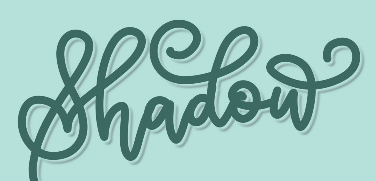
Happy Tuesday! It’s been a little while since we made some iPad lettering, so this week we’re creating floating shadows in Procreate. I’ve seen this effect referred to as ‘off shade’ before, but I’ve always thought of them as floating shadows. Essentially, it’s a drop shadow that’s disconnected, or there’s a space between your lettering and the shadow itself. I love how simple this effect is, but also how it adds that cool factor/semi 3D look right away. See how to apply this exact effect to your lettering below!

We have ALL been there. Days, weeks, or projects where there’s just nothing to grip onto upstairs. You scour the internet for inspiration, create mind maps and doodle out ideas, but find them all predictable; maybe even a little cliché. You start to question if creativity will ever locate you again, or worse – whether you ever had it to begin with. Oh, and this helpless feeling of creative block always happens at *the* worst possible time. Because it just wouldn’t make sense otherwise. Obviously.

So what can you do? Read on for 5 tips Spence and I have relied on throughout our creative careers to lift ourselves out of that inevitable rut.

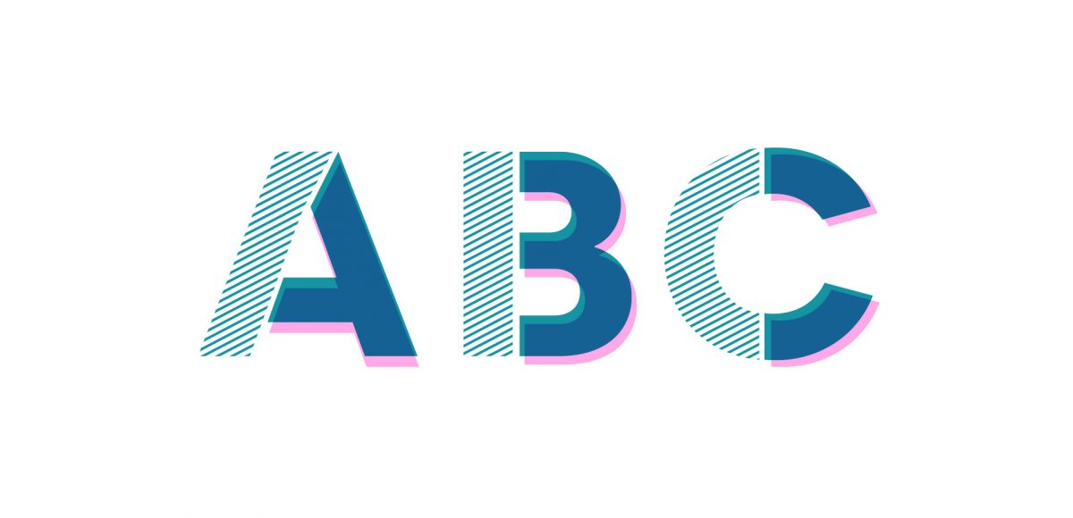
Jamie got in touch with me a few weeks ago, asking how to recreate the letters in this image. I loved that idea, though I had a bit of trouble tracking down the original source. I also wasn’t totally sure what to call this look, so we’re going with ‘pattern letters’ 😉

Essentially, we have letters with a multiply blend mode (so you end up with three colors including the overlap), plus a pattern element integrated into one of the strokes of the letter. This creates a semi-dimensional look, plus a beautifully colored one – perfect for modern headlines (or even logos!). Read on to create your own!

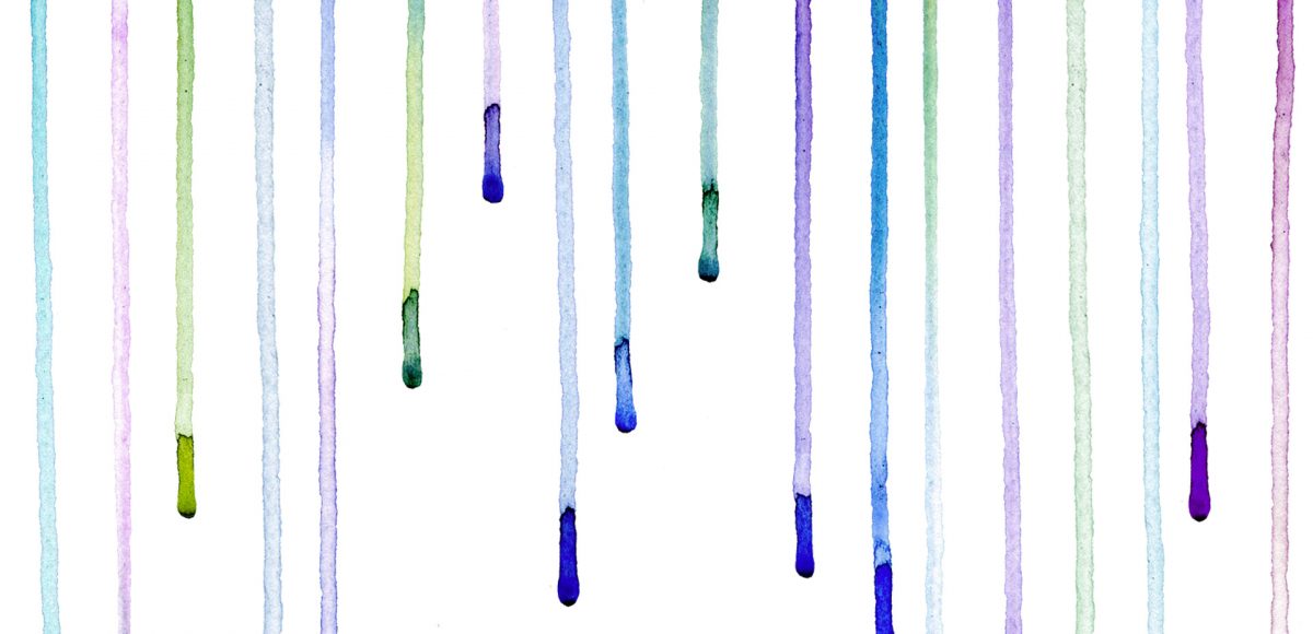
It’s time for your free April 2017 desktop wallpapers! This month’s (April showers) wallpaper was created using this Winsor & Newton watercolor pan set to carefully drip different colors on this Canson watercolor paper. I then scanned it and enhanced the colors using photoshop, then typeset April + the dates using my font, Miss Magnolia.

The download includes the wallpapers in two common resolutions: 1280x1024px and 1920x1080px, with and without dates. I’ve left the year off of the ‘no-dates’ versions, so you can use it for any April in the future, too!

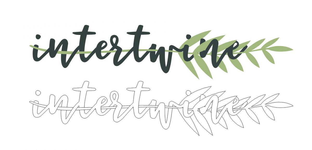
I secretly love creating tutorials that appear more difficult than they actually are. This week’s tutorial is exactly that, but also perfect for beginners with a really cool outcome. In this tutorial, we intertwine text and vector elements to draw attention to our messaging and make it visually striking at the same time. Read on for all the details!

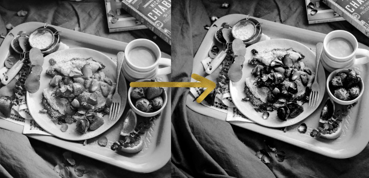
Happy Tuesday! I know we’ve been a little Illustrator crazy over here, but it’s hard not to love a program that has so many rescalable benefits! However! I definitely have not forgotten about Photoshop, so today I’ve got a video that I think will really help with your black and white photo enhancements. I’ve got two options for you this week: enhancing existing black and white photos, and best practices for converting a color photo into a black and white one. There are a few *really* simple steps you can take to bring them more to life, and this tutorial is perfect for beginners! Read on to get started with your own!

Ok, friends! Today is *the* day. My newest online course, Learn Font Making, is now open for enrollment (for one week only!).

When I started learning how to create hand lettered fonts, I definitely had the impression it was some super secret skill. I searched tirelessly for helpful tutorials that weren’t filled with a ton of ‘expert font making’ language I couldn’t understand. It was really hard to piece together little things I learned here and there, and I was still left with a lot of unanswered questions. Once I figured out the process, I knew I had to share it in a way anyone could learn. So! That’s what this class is: all step-by-step, beginner friendly with no confusion and as straightforward as possible.

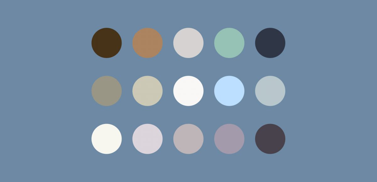
I am knee deep in preparing the launch of the new font making course (be sure to check back here next week!), so this week’s tutorial is a quick, but super handy tip for choosing color. There are many times I find myself needing quick color palettes in Adobe Illustrator, where I just need something beautiful that fits the mood. Adobe Color’s website has always been the perfect help for me whenever I’ve been in a color pinch. If you’re a Creative Cloud subscriber, it couldn’t be easier to grab a color palette, tweak it and start using it directly in Illustrator. Here’s how!

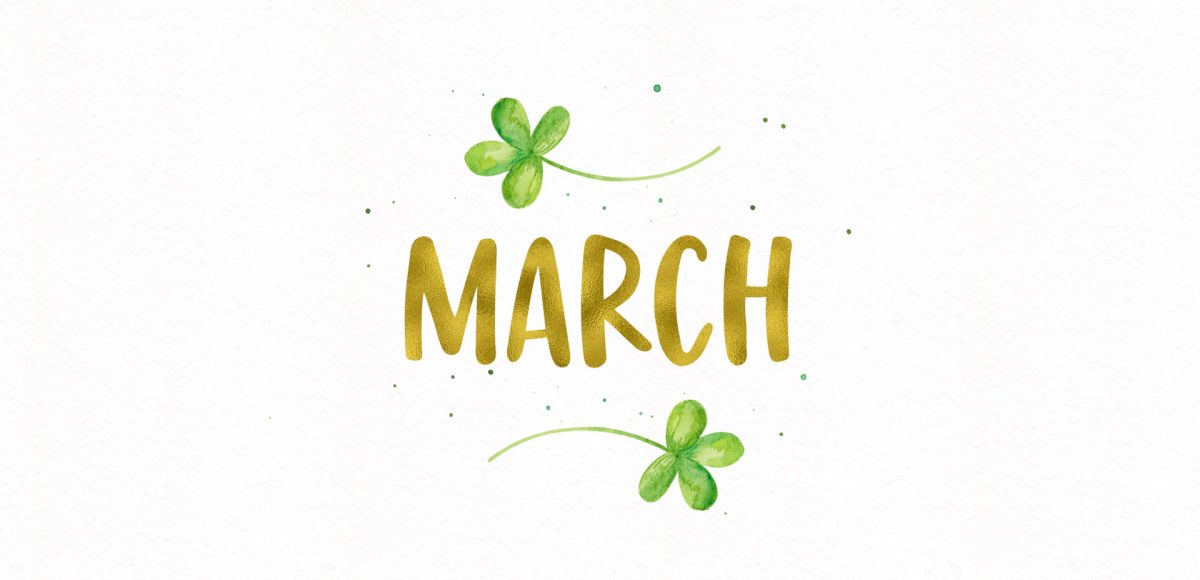
It’s time for your free March 2017 desktop wallpapers! I apologize for the tiny delay in this one going up – we had to move all of the site’s content over to the new design last week, so I wasn’t able to post anything new while that happened. As long as you still like these, I’ll keep makin em! 🙂

This month’s wallpaper was created with this Winsor & Newton watercolor pan set and a no.4 round Winsor & Newton Cotman brush. I used my newest font, Miss Magnolia, to typset ‘March’ (as well as the dates) and applied the gold foil texture from my Glitz + Glam kit. You’ll notice a subtle watercolor paper texture on the background too, which is part of the Watercolor Textures Vol. 3 kit 🙂

The download includes the wallpapers in two common resolutions: 1280x1024px and 1920x1080px, with and without dates. I’ve left the year off of the ‘no-dates’ versions, so you can use it for any March in the future, too!

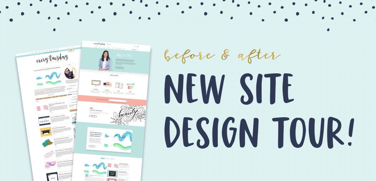
Wow. Today is a pretty big day. Our brand new site design, 6+ months in the making, is now live! This was a joint effort between Spence and I (though way more Spence than me) and it’s finally up! We didn’t hire any outside help, just hustled between the other things we were doing for the past half year (which is partly why it took much longer than we anticipated). We had a few goals in mind as we dove into this project, so today I wanted to share a site design tour, as well as our process + experience throughout the redesign.

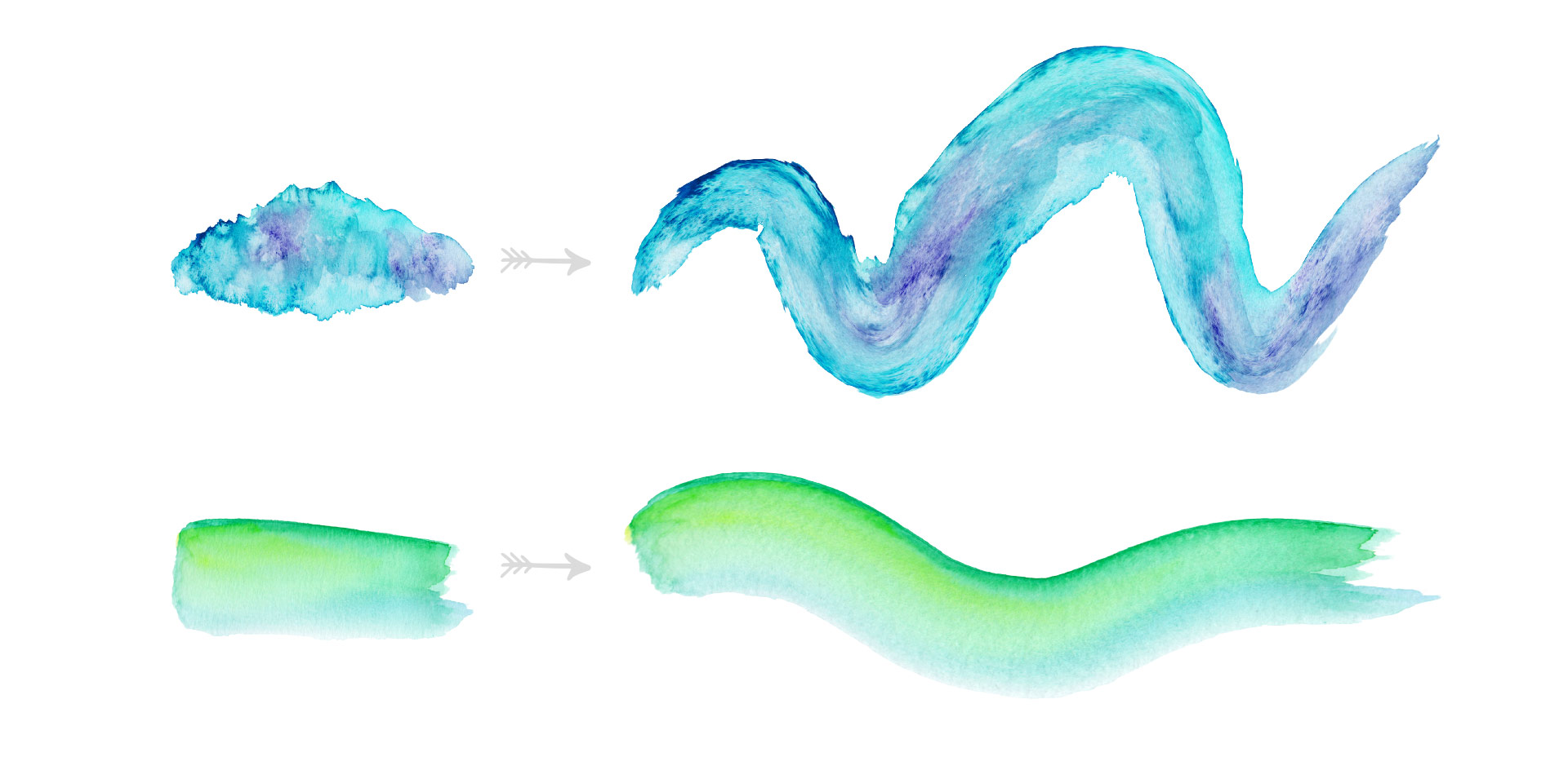
Happy Tuesday! I’m not gonna lie, this week’s tutorial is one of my favorites. Essentially, we’re combining the watercolor photoshop brush tutorial from a few weeks ago with last week’s ribbon tutorial. And we’re doing it all in Illustrator and keeping things simple and easy 😉 We’ll start by taking some watercolor textures on transparent backgrounds (like these, these or these), and then directly convert them into watercolor texture brushes in Illustrator. You’ll be able to transform the textures into any shape using the brush tool to create beautiful results. Create them once, then save them out for infinite future uses, too! Read on to see how!

GDPR Icon

Your Privacy Matters

We use cookies to customize and create content that’s most important to you. We’ll never share the info we collect.

View Privacy Policy